One of the main purposes of a presentation is to communicate ideas in a simple and visually appealing way. When slides are formatted well, audiences can understand information faster, stay focused on the message, and remember key takeaways more easily. The fonts, colors, spacing, and layouts you choose all influence how your content is received and which points stand out.
In this guide, you'll learn the basics of effective slide formatting, from focusing on one idea per slide and reducing unnecessary text to choosing the right layouts and maintaining consistency across your deck. We'll also look at how AI-powered presentation tools can handle much of the formatting work, helping you create polished presentations faster.
If you’re looking to hone your presentation skills, our guide covers how to hold attention and close the room. For the habits that confident speakers bring to every presentation, this piece on presentation tips covers the preparation framework that makes the whole thing feel effortless.
Key Takeaways
- Stick to one main idea per slide so your audience can follow the story without losing focus or attention.
- Replace long paragraphs with short phrases and bullet points that highlight the takeaway instead of the full thought.
- Pick a layout that matches the message, comparison, sequence, or single statement before you start adding content.
- Use visuals like icons and charts to reinforce ideas instead of decorating slides with unnecessary clutter.
- Hand off formatting, layout, and design to a tool like Presentations.AI so your rough ideas become polished slides without any manual work.
6 Steps to Format Your Ideas On a Slide
Formatting a slide well is less about design instinct and more about working through a short checklist in the right order. Each step below handles one layer of the problem, and each one makes the next decision easier. By the time you reach the last step, the slide practically organizes itself.
1. Start With One Main Idea Per Slide
Trying to say too much on a single slide is the biggest formatting mistake presenters make. When a slide carries three or four competing ideas, the audience loses track of where to look and tunes out before you finish your sentence.
Treat each slide like a single sentence in a larger story. If you cannot summarize the slide in one short headline, it probably needs to be split into two.
How to Spot a Slide That's Doing Too Much
Before you start formatting, look at your rough notes and ask the following questions.
- Does this slide make more than one point?
- Are there two different charts or data sets fighting for attention?
- Could you write a separate headline for each section on the slide?
If you answered yes to any of these, break the slide apart. It feels like more work, but the result is easier to read and easier to present.
Lead With the Takeaway
After you’ve narrowed each slide to one idea, write that idea as the headline. Skip vague titles like "Q3 Results" and use a full statement instead, something like "Q3 revenue grew 22%, driven by enterprise deals." The headline does the work, and everything below it supports the point.
Pro tip: If you're rewriting a deck, try this. Cover everything except the headlines and read them in order. If the story still makes sense, your formatting is on the right track.
This single shift, one idea per headline, changes how the rest of the slide comes together. You end up with better layouts, shorter text, and sharper visuals. Everything you do next builds on this foundation.
2. Cut the Text Down to What Matters
Trim the wording around the draft. Rough drafts include full sentences pulled straight from notes or scripts. That works for a document, but slides are meant to be glanced at while you talk, like cue cards.
If the audience is reading your slide, they are listening to you less. Short text keeps their attention where it belongs.
Turn Sentences Into Phrases
Look at every line on your slide and ask whether it could be shorter. A sentence like "Our customer support team responded to over 10,000 tickets last quarter" becomes "10,000+ tickets resolved last quarter." Same meaning, half the words, twice the impact.
Below are a few quick swaps that always work.
- Cut articles like "the," "a," and "an" where possible.
- Replace verbs with nouns when the noun carries the point.
- Drop filler phrases like "to" or "we are pleased to announce."
- Use numbers and symbols instead of spelled-out words.
Use Bullets With Purpose
Bullets are useful, but only when each one earns its place. Three to five short bullets work. Nine bullets in an 8-point font lose the audience. If your list keeps growing, that signals the slide is carrying more than one idea and needs to be split.
Keep bullets parallel, too. Start each one the same way, with a verb or a noun, and the list reads cleanly without the audience having to work for it.
A good test for slide text is to read it out loud in under five seconds. If you cannot, it is too long.
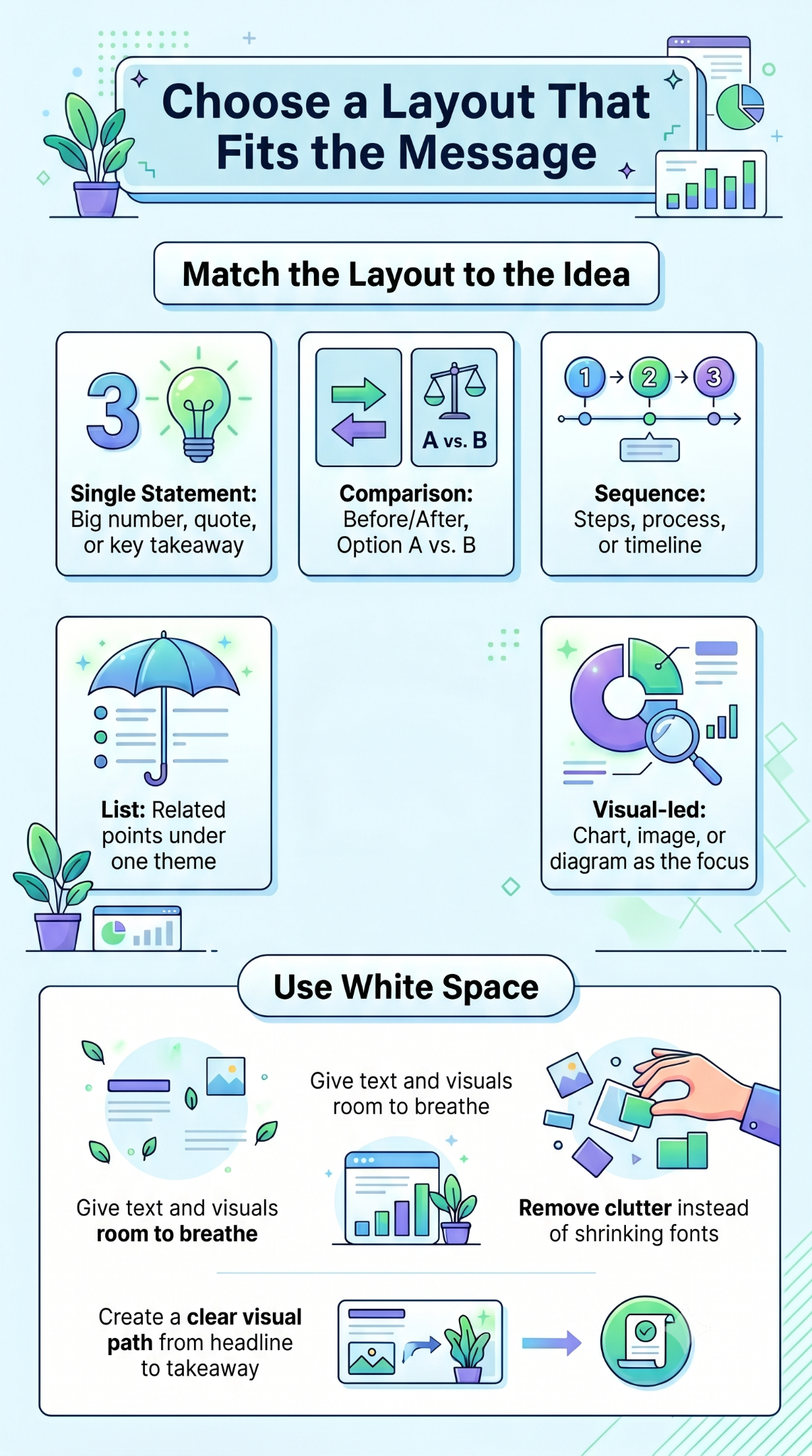
3. Choose a Layout That Fits the Message
The layout is where many presenters freeze. The blank slide offers endless options, so they default to a title at the top and a bullet list below, regardless of what the content actually calls for. The layout should follow the message.
Before you add anything to the slide, ask what point you are making. Ideas fall into a few simple shapes.
Match the Layout to the Idea
Here are the layouts that cover most situations.
- Single statement: One big number, quote, or sentence centered on the slide. Best for moments you want to land hard.
- Comparison: Two columns side by side. Best for before/after, us/them, or option A/option B.
- Sequence: A row of steps or a timeline. Best for processes or how something unfolds.
- List: Short bulleted items under a clear headline. Best for grouped points that share a theme.
- Visual-led: A chart, image, or diagram with a short caption. Best when the visual is the point.
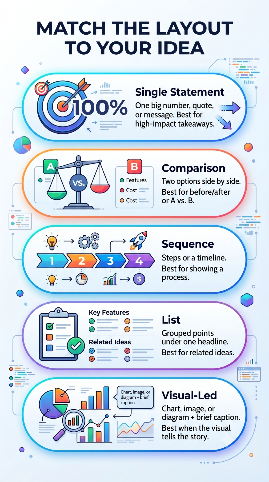
Pick the layout first, then pour the content in. Doing it the other way around is how slides end up cluttered.
Give Every Element Room to Breathe
White space is not wasted space. Margins around your text and visuals make the slide feel calmer and easier to scan. If your slide feels crowded, the fix is usually to remove something.
Can you trace a clear path with your eyes from the headline to the supporting content to the takeaway? If your eyes bounce around, the layout needs more structure or fewer elements.
Pro tip: Look at your slide from across the room or zoom out to 50%. If the main point is not obvious at a glance, rework the layout before adding anything else.
4. Add Visuals That Reinforce the Point
Visuals turn slides from readable to memorable, but only when they are doing real work. A stock photo of a handshake under "Partnerships" adds nothing. A chart showing 40% revenue growth, or an icon that anchors a concept, gives the audience something to hold onto.
Every visual on the slide should make the idea clearer or faster to understand. If it does not, cut it.
Pick Visuals That Carry Meaning
A few types of visuals tend to pull their weight. For examples of how strong decks handle each type across pitch decks, sales presentations, and reports, presentation examples show what purposeful visual choices look like at the slide level.
- Charts and graphs: Best when you want the audience to see a trend or comparison fast.
- Icons: Useful for breaking up text-heavy slides and giving each point a visual anchor.
- Diagrams: Great for showing how parts of a system connect or how a process flows.
- Screenshots or product images: Strong when you're showing something specific.
- Photos: Use sparingly, and only when the image tells part of the story.
Whatever you pick, keep the style consistent across the deck. Mixing flat icons with detailed illustrations makes the deck feel pieced together.
Let the Chart Do the Talking
When you use a chart, simplify it. Strip out gridlines you do not need. Highlight the one data point that matters by making it a different color. Add a short headline that states the takeaway. "Revenue grew 40% YoY" beats "Annual Revenue Chart" every time.
Did You Know? A well-labeled chart can communicate a trend or comparison in seconds that a paragraph of explanation takes much longer to convey. When the visual is the argument, the text becomes a supporting detail.
Visuals are shortcuts to understanding. When you treat them that way, your slides get sharper, and your audience stays with you.
5. Keep Everything Consistent Across the Deck
A deck with mismatched fonts, shifting colors, and uneven spacing feels unprofessional, even when each slide looks fine on its own. Consistency ties slides together and signals to the audience that you have your act together.
The good news is consistency is mostly about making decisions once and sticking to them. Pick your rules at the start, apply them everywhere, and the deck pulls itself together.
Set Your Rules Before You Build
Here are a few choices to lock in before you start formatting.
- Fonts: Pick one for headlines and one for body text. Two fonts maximum, across the entire deck.
- Colors: Stick to a palette of three or four. One for headlines, one for body, one or two accents.
- Headline placement: Decide where the title sits, top-left or top-center, and keep it there on every slide.
- Spacing: Use the same margins and padding so nothing feels off-balance from one slide to the next.
- Icon and chart style: Stay in one visual family. Avoid mixing flat icons with 3D illustrations.
If these rules exist, you stop making the same small decisions on every slide. That saves time and keeps the deck looking unified. Presentations.AI's presentation templates come with fonts, colors, and spacing already set to these standards, so you skip the setup and start building from a clean, consistent foundation.
Watch for Small Inconsistencies
The details that break consistency are usually small. A headline that is 32pt on one slide and 28pt on the next. A bullet list with periods on some lines and not others. A chart in blue when the rest of the deck uses green.
Run through the deck at the end and look for these mismatches. Building a master template so every new slide starts with the right defaults baked in prevents most of these issues before they appear.
Consistency is about removing distractions so the audience focuses on the ideas rather than the design choices.
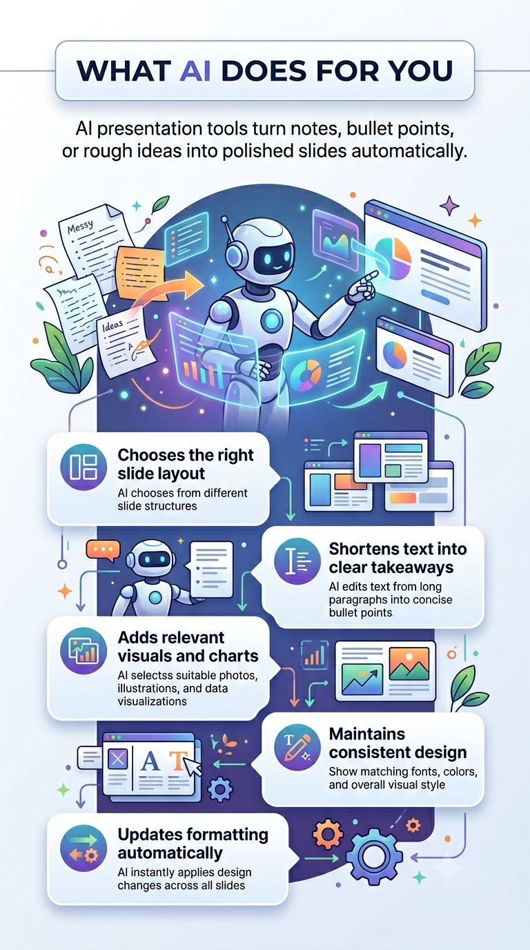
6. Let AI Handle the Formatting for You
Formatting takes time, even with clear rules in place. Resizing text, aligning elements, and choosing layouts add up. An AI presentation maker like Presentations.AI takes your rough ideas, bullet points, notes, or even a paragraph of thinking, and turns them into formatted slides automatically.
It selects the layout that fits each idea, trims the text, adds the right visuals, and keeps the design consistent throughout the deck. The rules you would have applied manually are baked in.
Instead of formatting every slide by hand, you describe what you want to say, and the AI handles the visual work.
What AI Takes Off Your Plate
Here is what shifts from your task list to the tool.
- Layout selection: The AI matches each idea to a layout, comparison, sequence, or single statement without you having to choose.
- Text trimming: Long sentences are automatically cut into short, scannable phrases.
- Visual choices: Icons, charts, and images are picked to match the message.
- Design consistency: Fonts, colors, spacing, and alignment remain uniform across all slides.
- Edits and updates: Change one idea, and the formatting adjusts around it, so you avoid reformatting from scratch.
When AI Formatting Helps Most
AI is especially useful when you're working against the clock or starting with rough notes rather than a polished script. It also helps anyone with good ideas who wants to skip the hours spent learning design rules.
The goal is to skip the formatting busywork so your ideas reach the audience the way you intended. Your thinking stays yours.
Even when you use AI, start with one clear idea per slide and a strong headline. The tool can format anything, but the message still has to be yours.
The Habits That Make Every Deck Work
Formatting a slide comes down to a few repeatable habits applied consistently. One main idea per slide. Short text that supports the headline. A layout that matches the message. Visuals that carry meaning. Consistency from the first slide to the last. None of these requires a design background, just a willingness to apply them every time.
If these habits become second nature, building a clean deck no longer feels like a struggle. When you want to skip the manual work entirely, an AI tool handles the formatting while you stay focused on the message. Either way, the goal is the same. Slides that get out of the way and let your ideas land.