Most founders pour weeks into a pitch deck, then watch an investor scroll through it in under five minutes. The gap between effort and attention is real, and it explains why so many strong companies still struggle to raise. Understanding how investors actually engage with decks changes how every slide should be built.
The data on pitch deck performance is more detailed than most founders realize. DocSend, a Dropbox company, tracks millions of deck interactions annually and publishes annual research. Papermark's report analyzed 8 million data points across 3,000 pitch decks. A Sequel study matched 17,500 pitch decks against actual funding outcomes. Together, these sources give a precise picture of investor behavior backed by real numbers.
This guide groups that data by theme: investor behavior, deck structure, fundraising success rates, and the impact of AI on the build process. Whether raising a first round or tightening an existing deck, these numbers give founders a clearer picture of what actually moves investors.
Key Takeaways
- DocSend's 2026 research puts the average VC review time for a seed deck at 3 minutes and 44 seconds, and only 58% of decks are read all the way to the final slide.
- Papermark's 2025 analysis of 3,000 pitch decks found that the first page receives more than twice as much attention as any subsequent slide, with subsequent pages averaging just 15 seconds each.
- The Sequel study of 17,500 pitch decks, published in September 2025, found that funded startups had design scores that averaged 38% higher than those of unfunded startups.
- The VerdanaBold 2025 survey found 55% of teams start every new presentation from scratch, and 55% spend 5 to 10 hours building a single deck.
- Professional agency-designed decks run $1,000 to $7,000 per project, while most AI tools start below $25 per month and can produce a structured first draft in a fraction of the time.
Investor Behavior: How Investors Actually Read Your Deck
Even before you start creating your deck and fret about fonts and slides, it is important to understand the person on the other side. Investors scan decks under real-time pressure and make fast judgments about whether something is worth a closer look. The data gives a precise picture of how that plays out in practice.
A useful frame: the average VC analyst reviews thousands of pitch decks a year and invests in a small handful of them. That volume forces an unavoidable triage process, and most decks get cut early. Knowing when and why that happens changes how you approach every slide.
Attention Is Short and Front-Loaded
Two of the leading pitch deck analytics platforms, DocSend and Papermark, track exactly how investors move through a deck. Their 2026 and 2025 reports, respectively, give founders specific numbers to plan around:
- Only 58% of pitch decks are viewed to completion, per DocSend's research, meaning nearly half of investors stop reading before the final slide.
- The first page of a deck receives more than twice the time of any subsequent page, per Papermark's analysis of 3,000 pitch decks.
- Average time per page drops to about 15 seconds after the first slide, according to Papermark's data.
- For seed decks, DocSend's research puts average VC review time at 3 minutes and 44 seconds.
- For pre-seed founders, DocSend's pre-seed guide notes the average rises to 4 minutes and 10 seconds.
The opening slide is doing more filtration work than any other element in the deck. Front-loading your problem, solution, and an early traction signal is the structural answer to this pattern, not a cosmetic polish.
Where Investors Actually Spend Their Time
DocSend's research gives founders a clear picture of which sections earn the most scrutiny, and the answer surprises most people:
- The team slide gets the most time of any section in funded decks, per DocSend's analysis. Financials gets the second most, and the product slide gets the least.
- Investors who spend more than 4 minutes on a deck convert to meetings at a substantially higher rate than those who spend less than 2 minutes, per DocSend's research.
- Average total view time across 3,000 pitch decks was 3.2 minutes, per Papermark's report.
The team slide commanding the most attention tells founders exactly where to invest editorial effort. If your team slide reads like a list of job titles and company logos, that needs to change before anything else.
Pro Tip: Read your deck in 90 seconds, headlines only. If the story holds up, you have built it for how investors actually scan.
Design Shapes First Impressions
Deck design directly affects whether investors keep reading, and the numbers from a major 2025 study back that up:
A Sequel study that matched 17,500 pitch decks with actual funding outcomes found that funded startups had design scores averaging 38% higher than those of unfunded startups.
Clean, consistent layout signals discipline and makes numbers easier to trust from the first slide. The design section of the VerdanaBold presentation survey provides useful context: 12% of respondents named design as their biggest presentation challenge. Most founders are underinvested in both design and storytelling, with storytelling cited as the top challenge by 47% of founders. The presentation tips guide covers how to address both together.
Deck Structure: Slide Count and What Belongs Where
Once the reading behavior is clear, structure becomes the highest-leverage variable in your control. The right slide count and sequence guide an investor through your story without friction. Too few slides leave gaps; too many bury the signal.
The temptation to overbuild is real. More slides feel thorough, but the data consistently points toward brevity. The good news is that the research is specific about what the right range actually looks like.
The Ideal Slide Count
Two independent datasets give founders a clear picture of where decks actually land and where they should land:
- 49% of all pitch decks analyzed are 9 to 16 pages, per Papermark's report covering 3,000 decks.
- DocSend's seed deck research recommends a full deck of 19 to 20 pages when an appendix is included, with the core story standing on its own in the first 12 to 16 slides.
A standard, investor-friendly flow draws on the clearest presentation examples from funded companies and covers:
- Problem: The pain point being solved, stated plainly.
- Solution: The product and why it fits the problem.
- Market: Size and opportunity, grounded in sourced data.
- Why Now: Timing context, increasingly included in successful decks.
- Traction: Proof that something is working.
- Business model: How the company makes money.
- Team: Why this group is the right one to win.
- The ask: How much is being raised and what it funds.
Starting from one of the structured presentation templates built for investor-facing decks gives your outline a format investors recognize immediately.

Order Shapes Momentum
Sequence matters as much as count. DocSend's research shows that founders who open with the company's purpose, problem, solution, and market size are more likely to raise capital than those who lead with a different approach. The narrative should draw a reader from one question to the next, so each slide answers the question raised by the previous one.
DocSend's research is also direct on the appendix: supplementary data, technical details, and expanded financials belong there rather than in the main flow. Interested investors will ask for more. Keep the core story clean enough to fit within four minutes.
Pro Tip: Outline your deck as a one-sentence summary per slide before designing anything. If those sentences read like a coherent story in order, your structure is sound.
The Time Investment Behind Every Deck
Deck building is a major time commitment for most teams, and the numbers from the VerdanaBold presentation survey make that clear:
- 55% of teams spend 5 to 10 hours preparing a single presentation, per the VerdanaBold survey of PowerPoint users.
- 16% spend 10 to 20 hours; another 16% spend more than 20 hours.
- 55% of teams still start every new presentation from scratch, despite having previous decks and templates available.
That time investment is why structure decisions made early, including slide count and section order, have such a large downstream impact. A clear framework reduces the hours spent on rework and revision.
Fundraising Success Rates and Why Decks Get Rejected
The context behind these numbers matters. Fundraising is competitive at every stage, and the baseline rates reflect that. Understanding those rates is less about feeling discouraged and more about directing effort to the right places.
Rejection is rarely one fatal flaw. More often, it is an accumulation of small friction points that push a skimming investor toward a pass. The encouraging side of that pattern is that most friction is within a founder's control.
The Funding Landscape in 2026
Capital is moving, but its distribution is increasingly concentrated:
- $91 billion was raised globally in Q2 2025 alone (Crunchbase), but a third of all that funding went to the largest companies.
- Roughly 50% of 2025 venture capital flowed into AI-related startups, intensifying competition for the remaining half.
For early-stage founders outside the AI category, differentiation through clarity and narrative structure matters more than it did in the looser funding climate of 2020 and 2021. A deck that communicates a clear story and credible traction is a genuine competitive advantage.
The Most Common Rejection Reasons
When investors pass, a consistent set of patterns emerges from DocSend's annual pitch deck research:
- Weak market sizing: Vague or inflated numbers undermine trust in the rest of the deck.
- Unclear traction: The lack of evidence of momentum makes the business story feel theoretical.
- Cluttered design: Visual chaos signals a lack of discipline and slows the read.
- Decks that run too long: Bloated decks dilute the message and exhaust attention before the ask.
Key Insight: DocSend's research also points to a specific slide-level pattern: investors spend significantly more time on unclear sections of unsuccessful decks. When the traction story is hard to parse, investors slow down trying to understand it rather than moving forward. Clarity in those sections, not more data, is what changes their trajectory.
Turn Weaknesses into Edits
Each of the above can be fixed before the deck goes out. A clearer market slide with a named data source, a sharper traction chart, and a tighter slide count are all revisions within a founder's reach. Treat each common rejection reason as a checklist line rather than a verdict on the business.
Improving these areas used to mean hours of manual redesign. That is exactly where AI tools are changing the workflow.
AI Trends: How AI Is Changing Deck Creation
Deck creation has changed significantly in a short period. The time and cost that once made a polished investor deck a serious project have both come down sharply, and the data from multiple independent sources backs that up.
For early-stage teams with no in-house designer and limited hours to spare, this shift is material. The time savings free founders to focus on narrative and numbers rather than layout and typography. And because design quality correlates directly with funding outcomes, tools that produce clean, consistent output remove one of the most consistent friction points investors encounter.
From Blank Page to First Draft
The VerdanaBold survey confirmed what most founders already know: pitch decks consume a significant amount of time. The AI alternative makes a striking contrast:
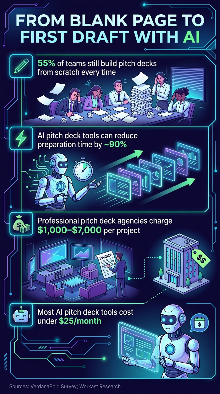
- 55% of teams still start from scratch each time rather than using templates or adapting prior work, according to the VerdanaBold survey.
- AI pitch deck generators cut preparation time by roughly 90% compared to manual builds, per a December 2025 analysis citing Workast research.
- Professional agency-designed decks run $1,000 to $7,000 per project; most AI tools start below $25 per month.
Iteration speed matters as much as the initial build. With AI tools, updating a deck between investor meetings to reflect new feedback or fresh traction data takes minutes rather than a rebuild. Founders who iterate quickly between conversations gain a real edge in fast-moving fundraising cycles.
Design Without a Designer
The Sequel study's finding that funded startups had design scores averaging 38% higher than unfunded ones tells founders something specific: getting to that visual standard used to require expensive agency help or a co-founder with strong visual skills. AI tools now make it achievable without either.
That shifts the baseline. The bar for what investor-ready looks like has risen as more founders use AI to produce clean, consistently formatted decks. Building with misaligned layouts and inconsistent fonts is no longer a forgivable constraint.
Building Decks with Presentations.AI
An AI presentation maker like Presentations.AI fits this workflow precisely. Founders describe their story, and the platform handles structure, layout, and design, turning the research-backed best practices throughout this guide into polished, investor-ready slides. No design work is required, and all outputs remain consistent with your brand through the Brand Sync feature.
Did You Know: Because Presentations.AI lets founders iterate in minutes rather than hours, it is practical to tailor a deck for each investor conversation instead of sending a single generic deck to every contact on the list.
What These Pitch Deck Statistics Tell Every Founder
The patterns across these numbers point in the same direction. Investors read fast, bet on teams they believe in, and reward clarity at every level: structure, slide count, text density, and visual design. The statistics are not a checklist to copy, they are a map of how investors actually think when deciding whether to keep reading.
Front-loading your strongest signals, keeping the core narrative within the 12 to 16-slide range, and building the team section to show actual outcomes rather than credentials all align your deck with documented investor behavior. The same logic applies to design: the 38% design-score gap between funded and unfunded decks in Sequel's research tells founders that polish is a signal, not vanity.
For more on the narrative and delivery side of pitching, the resources on presentation skills cover how strong structure translates from the deck into the room. Strong pitch deck data helps earn the meeting. The story and delivery are what close the round.