TL;DR
- Set titles at 36-44pt and body text at 18-24pt. Subtitles work at 28-32pt, captions at 12-16pt.
- Scale font sizes up as audience distance grows. Bigger rooms and bigger screens demand bigger type to stay readable.
- Virtual presentations need larger body text (24pt or more) because viewers watch on small, compressed shared-screen windows next to video.
- Use the 6x6 rule and the back-of-the-room test to catch oversized text and low-legibility slides before you present.
- Presentations.AI applies readable font sizing and consistent formatting automatically, so teams spend less time adjusting slides by hand.
What Is the Ideal Font Size for Presentations?
Squinting at a slide from the back of a conference room is a familiar frustration. Leaning into a laptop to read 14pt body copy during a video call ranks close behind. Font size looks like a small design detail, but it decides whether your audience reads your slides or tunes out.
In a high-stakes business deck, small text costs you attention. A prospect misses the pricing detail. An executive skips the footnote. A customer struggles to read the adoption metric. The slide still looks polished, but the message stalls.
The tricky part is that one number rarely fits every slide. The best font size shifts with the room and the type of text on the slide. Title text follows one rule. Body copy follows another. Captions follow a third.
Sales presentations and board updates rely on font size to support fast decisions. Your audience should understand the point before you start explaining the slide. This guide gives clear numbers for every part of your deck, from titles to data-heavy slides. It also covers in-person versus virtual talks, plus the tests professionals use to check readability before they present.
The short answer: set titles at 36-44pt and body text at 18-24pt. Subtitles hold at 28-32pt, and captions at 12-16pt. These ranges fit most business decks, from sales presentations to internal strategy decks shown on a standard projector or large monitor.
Ideal is a moving target. The right size depends on the type of text and how far away your audience sits. A slide that looks balanced on your laptop can turn unreadable on a 10-foot screen. The reverse applies when a stadium-sized title shows up on someone's phone during a webinar.
Why font size matters more than you think
Font size separates an audience that follows along from one that gives up. When the type is too small, people stop reading and start checking their phones. When it is too large, the slide feels aggressive and forces you to cut content that matters.
Sizing also ties to trust. Clean, readable typography signals effort. A slide with 11pt body copy imported from Word looks small and tells the audience the presenter skipped a readability check. Document sizes like 11pt and 12pt suit paper read at arm's length, not slides projected across a room.
The quick baseline to start from
If you remember one set of numbers, use these four:
- Titles: 40pt
- Subtitles: 30pt
- Body text: 22pt
- Captions and footnotes: 14pt
Start there, then adjust up or down based on the room and format. The next sections show exactly when to scale, and by how much.
Pro Tip: Never go below 18pt for any text your audience needs to read. If something must be smaller, it belongs in a handout, not on the slide.
Best Font Size for PPT Presentations by Use Case
Font size should match the job the deck is doing. A sales presentation delivered live needs readability from a distance. A leave-behind report read on a laptop can hold more detail per slide. Match your sizing to the use case before you fine-tune anything else.
Recommended Font Sizes for Titles, Body Text, Captions, and Labels
Every slide element does a different job, so each needs its own size range. Titles grab attention from anywhere in the room. Body text stays readable without feeling like a textbook. Captions support the content instead of competing with it.
Business decks also need readable charts and metric callouts. A pipeline slide with hard-to-read labels hurts as much as a paragraph set too small.
Here is the breakdown in one place:
Titles: 36-44pt
Titles set the frame for everything else on the slide. At 36-44pt they stay bold enough to read from the back row without crowding your layout. If your title runs onto two lines, drop a few points before you shrink the body text.
Subtitles: 28-32pt
Subtitles bridge your title and your content. Keep them at 28-32pt so they read as distinct from the title and clearly larger than body copy. A good rule sets subtitles at roughly 70% of your title size.
Body text: 18-24pt
Body text is where most font-size mistakes happen. Designers used to documents default to 11pt or 12pt, which vanishes on a projector. Stick to 18-24pt, and lean toward the higher end when a slide holds more than two lines of text.
Captions and footnotes: 12-16pt
Source citations and image credits belong in the 12-16pt range. They should stay visible while staying quieter than the main content. If a caption carries information your audience needs to read aloud, promote it to body size.
Pro Tip: A simple ratio helps: titles run about twice the size of body text, and body text about 1.5x the size of captions. Break that ratio and the slide feels visually off, even when the audience struggles to name why.
Font Size for Data Slides, Charts, and Tables
Data-heavy slides expose font-size problems fastest. A sales dashboard or financial summary packs many small text elements into one frame, and each one has to stay readable. When a chart or table pushes you toward tiny type, treat it as a signal to simplify instead of shrink.
If a chart needs labels below these thresholds to fit, the chart is doing too much. Split it across two slides, or cut the number of data series. A clear chart with fewer numbers beats a crowded one the audience struggles to read.
Start With the Presentation Use Case
Before you touch a single point size, decide how the deck will be used. Font size shifts depending on whether the deck runs live, ships as a document, or drives a large-stage keynote. The core question stays simple: does readability from distance matter more, or information density?
- Presented live: Readability from distance wins. Size up titles and body text, and keep word counts low.
- Shared as a document: Density is acceptable. Viewers control zoom, so smaller body copy and denser tables work fine.
- Used for training: Balance both. Slides get projected and revisited, so keep body text readable while allowing more detail.
- Large-stage keynote: Readability from distance dominates. Push everything larger and strip slides to a few words.
Answer that question first, then apply the ranges above. The remaining decisions get easier once the use case is clear.
Font Size Recommendations for Leave-Behind Decks and Reports
A live presentation and a leave-behind deck are two different products, even when they share slides. Decks meant for on-screen reading or PDF export can use smaller type than projected slides, because the viewer controls zoom and sits close to the screen.
Even in a document-style deck, keep accessibility in mind. Anything the reader must understand should stay legible at 100% zoom. Reserve the smallest sizes for source notes and citations, keeping them away from content that carries the argument.
How to Adjust Presentation Font Size for Room Size, Screen Type, and Format
The ranges above assume an average room and a standard screen. Once those variables change, your sizing has to adapt. The same 22pt body text can look perfect in a 20-person meeting room and turn unreadable in a 200-seat auditorium.
How to choose font size based on viewing distance
Audience distance drives the biggest change. A common guideline: the farthest viewer should sit within eight times the height of the screen. If your back row exceeds that distance, scale every font size up. Use this lookup as a starting point:
In-person presentations
- Small meeting rooms (under 20 people): Standard sizes work fine.
- Mid-size conference rooms: Bump titles to 44pt and body text to 24pt.
- Large auditoriums or stages: Titles at 48-60pt, body at 28pt or higher.
Virtual presentations and webinars
Virtual settings flip the rules. Your audience watches on laptops, tablets, or phones, with your slides squeezed into a shared-screen window beside a video grid. That smaller display swallows small type fast.
For virtual meetings, push body text to 24pt or higher and keep titles near 40pt. Avoid long blocks of text. A viewer on a phone finds even 18pt body copy hard to read.
Screen type matters too
A projector and a phone screen render text differently. Projectors soften edges and cut contrast, which makes thin or small fonts harder to read. When in doubt, design for the lowest-quality screen in the room.
Pro Tip: Before a hybrid presentation, open your deck on your phone. If body text reads hard there, your remote viewers will struggle too.
Presentation Font Size Rules of Thumb and Mistakes to Avoid
Simple tests catch font-size problems before they go public. Two of the most useful rules predate modern slide software and still hold up today.
The 6x6 rule (and the 5-5-5 and 7-7-7 variations)
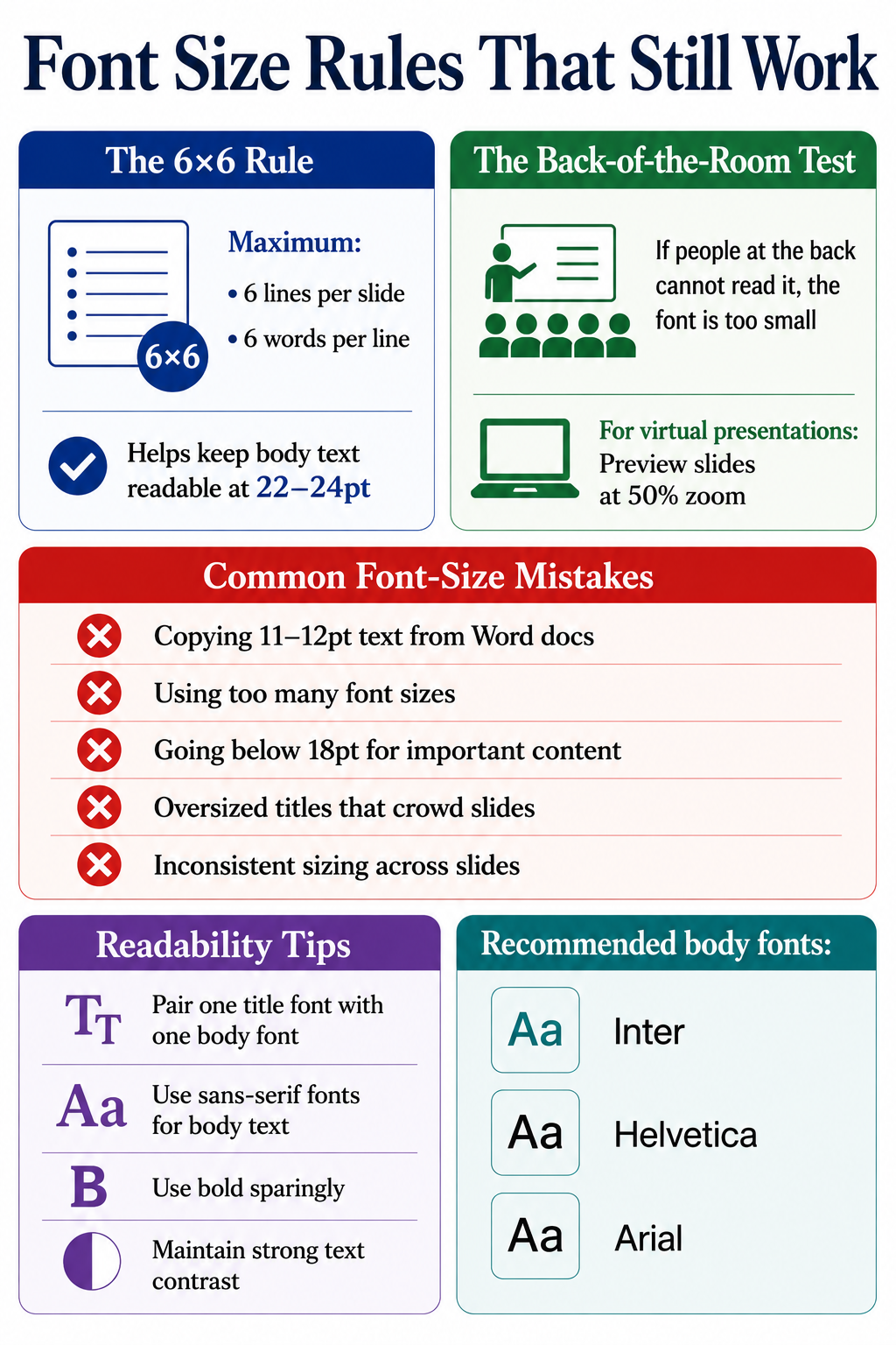
The 6x6 rule caps a slide at six lines and six words per line. It targets the symptom instead of the font size directly. Respect 6x6 and your body text gains room to breathe at 22-24pt instead of shrinking to fit a wall of words. The 5-5-5 rule tightens the count to five words per line and five lines per slide. It also caps five text-heavy slides in a row. The 7-7-7 rule follows the same logic with looser limits. All three exist to reduce text volume so your fonts stay readable. Applying this alongside a solid presentation outline keeps your content and typography in good shape from the start.
The back-of-the-room test
The back-of-the-room test takes one walk. Project your slide and walk to the back of the room. If you struggle to read every line, your font is too small. For virtual decks, preview slides at 50% zoom on your laptop, which approximates a shared-screen window. Running this test regularly sharpens your overall presentation skills over time.
Before you present: a quick readability checklist
- Preview the deck at 50% zoom on your laptop.
- Open the deck on your phone to check remote readability.
- Walk to the back of the room and read every line.
- Confirm every readable element sits at 18pt or above.
- Check that every chart label and table cell stays legible.
Common font-size mistakes
A few patterns show up repeatedly in weak decks:
- Copying body copy from a Word document. Document text runs 11-12pt. On a slide, it vanishes.
- Mixing too many sizes. Hold to three sizes per slide: title, body, caption.
- Going under 18pt for readable content. If it matters, make it big enough.
- Shrinking chart labels to fit more data. If a sales dashboard or usage chart needs 9pt labels to fit, simplify the chart or split it across slides.
- Oversized titles that crowd the slide. A 60pt title in a small room looks aggressive and eats your content space.
- Inconsistent sizing across slides. Your title reads 40pt on slide 2 and 36pt on slide 5. Small inconsistencies erode trust.
Font Type, Line Spacing, and Readability Tips
Font size works together with font choice. A clean sans-serif at 22pt reads easier in a pipeline review or leadership update than a thin serif at the same size. Two fonts at the same point size can read differently because of differences in weight and x-height. These presentation tips on pairing and hierarchy apply once you have sizing dialed in:
- Pair one display font for titles with one clean body font for everything else.
- Stick to sans-serif fonts like Inter or Helvetica for body text on screen.
- Favor fonts with a generous x-height, which read larger and clearer at the same point size.
- Use bold sparingly. Emphasis loses power when half the slide is bolded.
- Keep strong contrast between text and background. Light grey on white kills readability at any size.
Did You Know: Line spacing matters almost as much as font size. Setting line height to 1.3-1.5x your font size keeps text readable, even when sizes get tight.
How AI Tools Can Help Keep Slide Fonts Readable
Checking title sizes and chart labels across 30 slides by hand gets tedious fast. That repetitive work slows business teams down in PowerPoint. The AI presentation maker at Presentations.AI applies font-size rules automatically by slide type, so titles hold in the 36-44pt range and body text stays at 18-24pt, with captions scaled below both.
Font sizing is one part of the workflow. Presentations.AI turns rough notes, outlines, and business inputs into structured slides, then applies consistent formatting automatically so you avoid rebuilding layouts by hand.
Traditional slide tools leave every formatting decision to you. That means resizing text boxes, checking chart labels, and repeating the same cleanup across every slide. Presentations.AI changes that workflow by applying structure and formatting rules as the deck gets created. The platform reads the role of each text block and scales it to fit the layout while keeping your hierarchy intact. Add a long subtitle and it adjusts spacing instead of shrinking type into the unreadable zone. Switch a deck from in-person to webinar mode and the system bumps body sizes up so remote viewers follow along.
A few ways this saves time:
- Smart defaults by slide type. Title slides and executive summaries each get readable, professional sizing from the start.
- Consistent formatting across the deck. Fix title sizes and chart labels once instead of slide by slide.
- Built-in readability checks. The editor catches text that gets too small before it reaches a prospect or customer.
- Faster repurposing for new formats. Turn a boardroom deck into a webinar version while skipping the manual resize on every slide.
- Less time in PowerPoint cleanup. Spend more time sharpening the argument and less time measuring point sizes.
The AI slide creator handles the formatting rules so you can focus on building the argument instead of measuring point sizes slide by slide.
Final Takeaway: Use Readable Font Sizes for Every Presentation
Font size ranks among the smallest design choices with the biggest payoff. Get it right, and your audience reads and remembers. Get it wrong, and the message gets lost before it lands. The numbers to anchor on stay simple: titles at 36-44pt and body text at 18-24pt. Subtitles hold at 28-32pt, captions at 12-16pt. Adjust upward for large rooms and virtual viewers, and keep readable content at 18pt or above.
The goal centers on fast understanding over decoration. Make every slide clear at a glance. When your title, body copy, and chart labels are sized correctly, your audience spends less time decoding the slide and more time following the argument. To skip resizing every title and text box by hand, let Presentations.AI handle the formatting for you.