TL;DR
- AI-generated slides always need a human edit pass. A deck that looks finished differs from one that is decision-ready.
- Text overload is the clearest sign of an unedited AI deck. Keep one clear idea per slide and push detail into your notes.
- AI can invent statistics and make confident claims that fall apart. Verify every data point against a source before you present.
- Vague prompts and weak structure cause predictable failures. Off-brand design and cluttered layouts do too. A quick review fixes each, including unreadable charts.
- Presentations.AI reduces most of these problems by default through Brand Sync and adaptive layouts. Clip-E adds conversational editing on top.
Why AI Presentation Tools Produce Predictable Mistakes
AI presentation tools produce predictable mistakes because of how they handle your inputs. You have CRM notes and campaign results, plus a meeting on the calendar. AI turns those raw inputs into a deck fast. A deck that looks finished is not always ready for a VP or an investor.
Most AI presentation mistakes happen here. The slides look polished enough to share, so the editing pass gets skipped. Then you present, and halfway through, the room goes quiet for the wrong reason. The story reads thin. The data looks shaky. The slides carry too much.
The mistakes people make with AI presentations follow clear patterns. They come from how these tools work and what they were built to optimize for. Once you know what to look for, the fixes are quick. This post walks through the most common ones and shows how to correct each before your next presentation. To see strong AI-assisted slide creation from the start, Presentations.AI is worth a look.
Every AI presentation tool works roughly the same way under the hood. You give it a prompt. It generates slide content from patterns learned across a large dataset, then applies a visual layout.
Most tools struggle to understand your full business context on their own. They also struggle to verify every claim or spot the point that matters most to your audience. Your input still matters. Tools with stronger prompting and brand controls produce better first drafts, and conversational editing helps too.
You still need a short editing pass before you share the deck. The right AI presentation assistant reduces the manual work before that pass begins. It structures the narrative and keeps layouts consistent. It applies your brand and makes slide-level edits easy. That is the workflow our AI Presentation Maker is built for.
AI Presentation Mistakes at a Glance
7 Common AI Presentation Mistakes and How to Fix Them
AI presentation mistakes usually start with one of two things: unclear input or a skipped editing pass. The fix stays simple. Give the AI better context, then tighten the deck before anyone else sees it.
Mistake 1: Giving the AI a Vague Prompt
A vague prompt is where most bad AI presentations start. Someone types "Make a presentation about our product" or "create a deck on Q3 results," then hits generate. The tool does its best with barely any real context. The output ends up generic because the input was generic.
AI tools depend on what you give them. They produce better output from better raw material. Detail separates a vague prompt from a specific one, and length matters less.
For a sales deck, include the buyer persona and the deal stage. Add the objections you expect and the next step you want. For a QBR, include the customer's goals and usage data. Add the wins and risks so far. Note the renewal context too. For an investor update, include the time period and the key metrics. Add the narrative and the decision you want from the room.

The fix: Give the AI audience, context, and outcome
Before you type your prompt, answer three questions:
- Who will be seeing this presentation?
- What do they already know, and what do they need to decide?
- What should they do after the last slide?
Use this prompt structure:
- Audience: Who is in the room?
- Context: What do they already know?
- Input: What notes, data, or documents should the AI use?
- Outcome: What decision or action should the deck drive?
- Constraints: How many slides, how much time, and what tone?
Feed these answers into your prompt. A prompt like "Create a 10-slide deck for a VP of Sales evaluating two vendor options. The audience knows our industry but not our product. The goal is to get a demo scheduled by the end of the week" will produce better results than a one-liner.
Mistake 2: Not Editing the Output
Skipping the edit pass is the most common mistake, and it compounds every other one here. AI-generated slides look polished. They carry clean layouts and reasonable structure, with visuals that seem to fit. People assume the work is done and share the deck untouched.
A deck can look professionally designed and still hold hollow phrasing and wrong assumptions about your audience. It can open weakly and close on a slide that lands flat. All of it hides at a glance.
The fix: Run a 10-minute edit pass
Build a short editing pass into your process after every AI generation. It stays short. Ten minutes covers a standard deck once you know what to look for. Read the opening slide and ask whether it makes sense to someone new to your company.
Read the closing slide and confirm it names a specific action. Scan every bullet and cut the ones your audience could have guessed on their own. Those three checks alone lift most AI-generated decks.
Mistake 3: Overloading Slides with Text
AI tools default to thoroughness. Give them a complex topic, and they try to cover it completely, packing slides with bullet points. The result is a deck where every slide reads like a written report turned into slides by accident.
Text-heavy slides communicate less than lean ones. Your audience reads instead of listening, so they fall behind or tune out. A presentation and a document serve different purposes.
The fix: Use one clear idea per slide
Apply a one-idea-per-slide rule. Every slide should carry one clear point. If a slide has four or five bullets, ask which single thing you most want your audience to remember.
A good test: if the audience can understand the slide without you, it may be too much like a document. If they need your explanation to connect the point to the decision, the slide is probably doing its job.
That becomes the headline. The other points get cut or move into your speaker notes. If you read slide text aloud word for word during a presentation, the content belongs in your notes. An AI Slide Creator built around the one-idea-per-slide rule resists text bloat automatically. It generates a single focused message per slide instead of dumping every bullet into a wall of copy.
Mistake 4: Ignoring Design Consistency
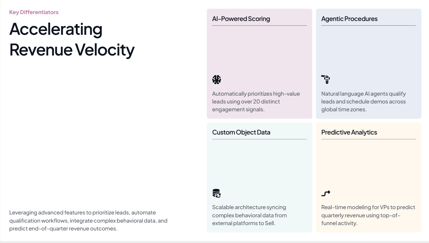
Design consistency is the complaint people voice most about AI-generated presentations. They look like a borrowed template instead of something from your company. The colors sit slightly off. The fonts miss your brand. The logo appears on the first slide and vanishes after. By slide three, the deck already looks like it belongs to someone else.
AI presentation tools learn your brand only when you tell them. They apply whatever default theme they carry, which can look clean while holding zero brand identity. When your deck reaches a decision-maker who has yet to meet you, that missing identity becomes a problem.
The fix: Lock brand rules before generation
Before you generate anything, make sure your tool knows your brand. At a minimum, set your primary colors and font, then add your logo. If you adjust these by hand after generation, block a few extra minutes to check every slide for a consistent visual style. Watch icon sets and background treatments, which drift slide by slide in AI output. Image tone drifts too.
Mistake 5: Trusting AI-Generated Facts Without Checking Them
AI tools generate statistics and market figures with complete confidence, along with research citations. Some numbers stay accurate. Many fall apart. The real ones and the fabricated ones look identical in the output. They sit side by side on the same slide, formatted the same way, hiding which ones you can present in a meeting.

Presenting a fabricated statistic to a room where someone knows the real figure gets uncomfortable fast. Presenting one in a board deck or an investor pitch gets worse. It raises questions about every claim in your presentation, beyond the one that broke.
The stakes climb in board updates and investor pitches. QBRs and sales proposals carry the same risk, and so do performance reviews. In those rooms, one unsupported number weakens the entire argument.
The fix: Treat every AI-generated number as a placeholder
Treat every AI-generated statistic as a placeholder. During your editing pass, open a browser tab and verify each data point against a primary source. If you cannot find the source in 30 to 60 seconds, swap the number for language you can stand behind. "Significantly faster" without a percentage sounds modest, and it stays far safer than a percentage that collapses under questions. For any data slide that matters, supply the numbers yourself instead of asking the AI to invent them.
Presentations.AI lets you swap in verified data while the layout stays intact, so you correct the slide without rebuilding it.
A note on fact-checking
This one mistake stays beyond every AI tool today. The verification step belongs to you. A good tool makes it easy to edit individual slides and swap in verified data while the layout holds. Presentations.AI's editing interface is built for that kind of targeted revision.
Mistake 6: Generating Too Many Slides
Give an AI tool a moderately complex topic and skip the slide count, and it usually produces more slides than you need. The tool optimizes for coverage. It tries to include everything, adding a slide for every sub-point and sub-sub-point until the deck feels comprehensive.
A 20-slide deck when 10 would do dilutes your argument instead of adding weight. The three or four slides where your real point lives get buried under extra context readers skip over. Your audience loses the thread, and you rush through slides you should have cut.
The fix: Set the slide count before you generate
Specify your slide count in the prompt. "Build an 8-slide deck" yields a meaningfully different output than an open-ended request. After generating, go through the deck in thumbnail view and ask yourself, for each slide: would I actually talk about this if I had 5 minutes less? If the answer is no, cut it. A shorter deck with a clear argument lands better than a long deck that covers everything.
Mistake 7: Skipping a Narrative Structure
AI presentation tools organize information into a logical sequence well. They struggle to craft an argument that leads to a conclusion. A list of related topics differs from a presentation that moves an audience from a recognized problem to a solution they want. Most AI-generated decks produce the list.
For business decks, the structure does more than organize information. It moves the room toward a decision such as approving the budget or renewing the account. In other cases it means backing the strategy or funding the next milestone.
The result feels like a report read in slide format. Each slide makes sense alone, and each one stalls there. The deck holds no tension and no turn, so the argument stays at setup and skips the recommendation. Audiences disengage because the deck sits still.
The fix: Restructure the deck into three movements
After you generate your deck, restructure it into three movements. The first section, roughly two or three slides, establishes the problem and why it matters now. The middle section presents your solution with supporting evidence. The final section, one or two slides, names a specific action. The content the AI generated may be largely fine. The sequence usually needs work. Move slides around until the structure follows that shape, and that is often all it takes. For more on this, read our blog.
3 More AI Presentation Mistakes to Watch For
Mistake 8: Using Irrelevant or Distracting Visuals
AI tools reach for generic stock imagery and overly literal icons. They add decorative illustrations and animations that fill space while adding little meaning. A slide can look busy and designed while its visuals skip the point you are making.
The fix: Use visuals only when they clarify a point
Check every image against the slide headline. If a visual fails to help the audience understand or remember the point, cut it. Replace generic images with charts and diagrams that move the argument forward. Screenshots and customer-relevant visuals work too.
Mistake 9: Creating Cluttered or Misaligned Slide Layouts
Crowded slide areas and weak whitespace make even accurate content hard to follow. Inconsistent margins and misaligned icons compound the problem, and too many competing elements finish the job. AI output drifts on spacing and alignment from one slide to the next, which muddies the reading order.
The fix: Give every slide room to breathe
Review each slide in thumbnail view. Leave enough whitespace and align elements to a grid. Make the headline the dominant visual element so the reading order stays obvious. Removing competing elements improves comprehension more than adding another graphic.
Mistake 10: Using Unreadable Charts or Misleading Data Visualizations
A chart can rest on real data and still confuse the room. AI picks the wrong chart type or drops axis labels. It leaves scales and legends that mislead. Verifying a number differs from communicating it clearly.
The fix: Turn each chart into one clear insight
Check the chart type and axis labels first. Confirm the scale and legend read clearly. Check the contrast and data-source note too. Then confirm the chart supports the slide's main takeaway. Reduce complex charts to a single insight, and add a headline above the visualization that states the point in plain language.
Quick Checklist: How to Review an AI-Generated Presentation in 10 Minutes
- Confirm the audience and the decision the deck must drive.
- Check that the opening slide makes sense to someone new to your company.
- Verify the closing slide names a specific action.
- Cut any bullet your audience could have guessed on their own.
- Validate every statistic against a primary source.
- Confirm the slide count matches the time you have.
- Check that the narrative moves from problem to evidence to action.
- Inspect visuals and remove anything that fails to clarify a point.
- Test chart readability, including axis labels and a takeaway headline.
- Confirm brand and design consistency across every slide.
How Presentations.AI Helps You Avoid These Mistakes
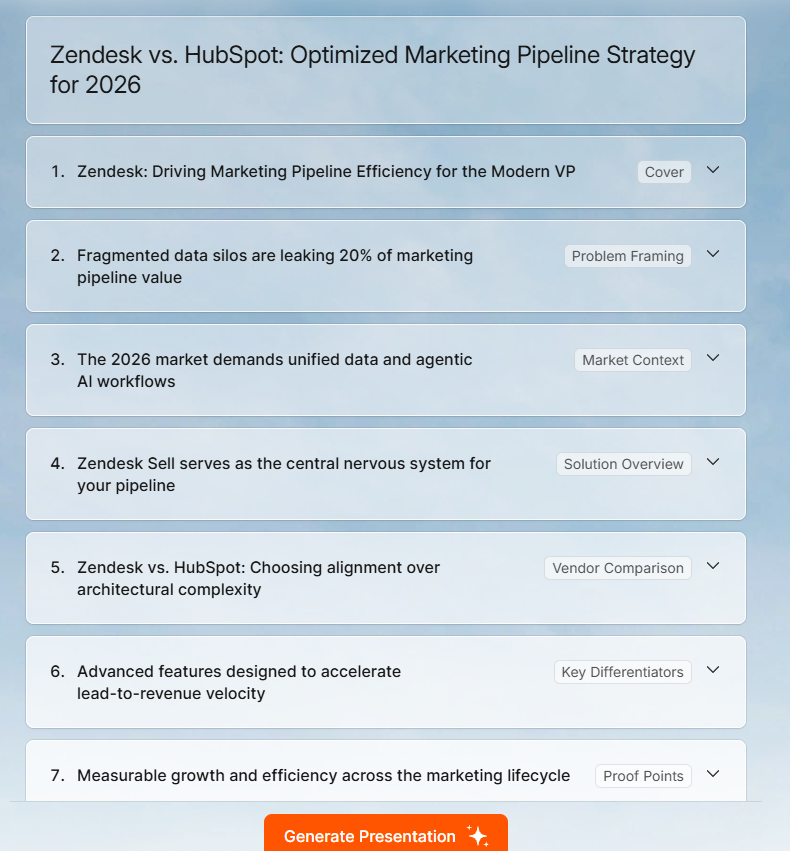
Presentations.AI targets the part of presentation work that slows business teams down. It turns messy inputs into a clear structure and keeps slides on brand. It also lets you edit while the layout stays intact.
Most of the mistakes above come down to two things: unclear inputs and skipped editing. The Presentations.AI platform reduces both. You can read the full feature set on the Presentations.AI AI presentation maker page. Here is how it addresses the most common problems.
Brand Sync: Add your company URL, and Presentations.AI pulls in your colors and fonts automatically, along with your logo. Your deck starts on-brand, so you skip fixing colors and logos slide by slide before a meeting.
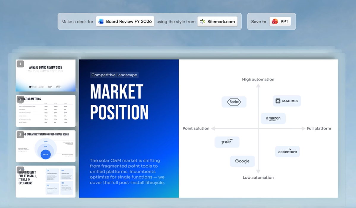
Adaptive layouts: As you shorten or rewrite content, the layout adjusts with you. You can simplify the story while the slide holds its shape. See Presentations.AI's presentation templates.
Multiple input formats: Start from the material you already have, such as PDFs and Word docs. URLs, notes, and rough outlines work too. Presentations.AI turns messy inputs into a structured first draft instead of a blank slide.
Clip-E conversational editing: Refine the deck through chat. Ask Clip-E to shorten one slide or sharpen the takeaway. Ask it to restructure a section or rewrite for a specific audience, all while your text boxes stay untouched.
PowerPoint export: Export to .pptx with fonts and layouts intact, plus your brand elements, so your team uses the deck where business already happens.
You still run your editing pass, particularly the data verification step. The platform reduces the number of things you fix and makes the remaining fixes faster.
How to Avoid Common AI Presentation Mistakes Before You Present
AI presentation tools earn their keep. Their value comes from strong first drafts produced fast, which gives you something real to work with instead of a blank slide and a deadline.
The mistakes in this post share one core issue: treating AI output as done when it is only a starting point. The fixes stay simple. Better prompts and a short editing pass do much of the work. A slide-count limit and verified data carry most decks from looks-fine to genuinely useful, and a quick structure check finishes the job.
The old workflow ran manual. You pasted content into PowerPoint and fixed layouts. You chased brand consistency and rebuilt charts, over and over. The better workflow runs AI-assisted. Start with your raw inputs, generate a structured first draft, then use your judgment to sharpen the story.