TL;DR
- Visual presentations turn dense notes and business data into clear slides built on images and charts instead of crowded bullet points.
- Audiences absorb and remember visuals far better than text read aloud, so visual slides drive faster comprehension and stronger stakeholder decisions.
- The core rule is simple: one idea per slide, supported by one clear visual that makes the message instantly obvious.
- You can build credible sales and leadership decks without a design degree. Consistent colors and generous whitespace do most of the work.
- Presentations.AI turns messy inputs into structured, decision-ready decks automatically. It handles the narrative and layouts so you focus on the message.
Introduction
You have a sales proposal or investor deck due soon. The inputs are messy, including scattered notes and a few half-finished slides. The default move is familiar. You open PowerPoint, paste everything in, then hope the audience follows.
That is how you end up with 20 slides of tiny text and stakeholders checking their phones. Visual presentations take the opposite approach. They lean on images and clean layouts to carry the message. The audience listens and remembers what you said.
The good news: you do not need to be a designer to make this shift. You need a clear message and a handful of principles that keep your slides focused.
This guide breaks down what visual presentations are and why they consistently outperform text-heavy decks for business communication. It also covers exactly how to build your next deck to be more visual, step by step, with examples and practical tips you can use today.
The hard part goes beyond making slides look better. It is turning messy inputs into a clear story quickly. Sales notes and strategy docs arrive in raw form, far from presentation-ready. AI-assisted workflows change the process. Instead of formatting every slide by hand, you start with the message and let the system handle structure and polish. The old way asks you to become a designer and analyst at the same time. The better way is to decide what needs to be said, then let AI handle the repetitive slide-building work.
What Is a Visual Presentation?
A visual presentation is a deck that communicates through images and charts with minimal text. Instead of cramming every talking point onto a slide, visual presentations let each slide carry one idea. A single visual element makes that point instantly clear.
Consider the difference this way. A text-heavy slide about quarterly revenue might list eight bullet points plus a footnote everyone skips. A visual slide covering the same content shows a single bar chart and a bold headline with the key number. Same information. Completely different experience for the audience.
It also helps to distinguish a visual presentation from adjacent formats. A written report is built for detailed reading, where dense text and full context are appropriate. A standard text-heavy slide deck tries to do both jobs at once and fails at each. A visual presentation is built for live communication and fast comprehension. The slide supports the speaker instead of replacing them. When you need a decision in the room, the visual presentation is the right format.
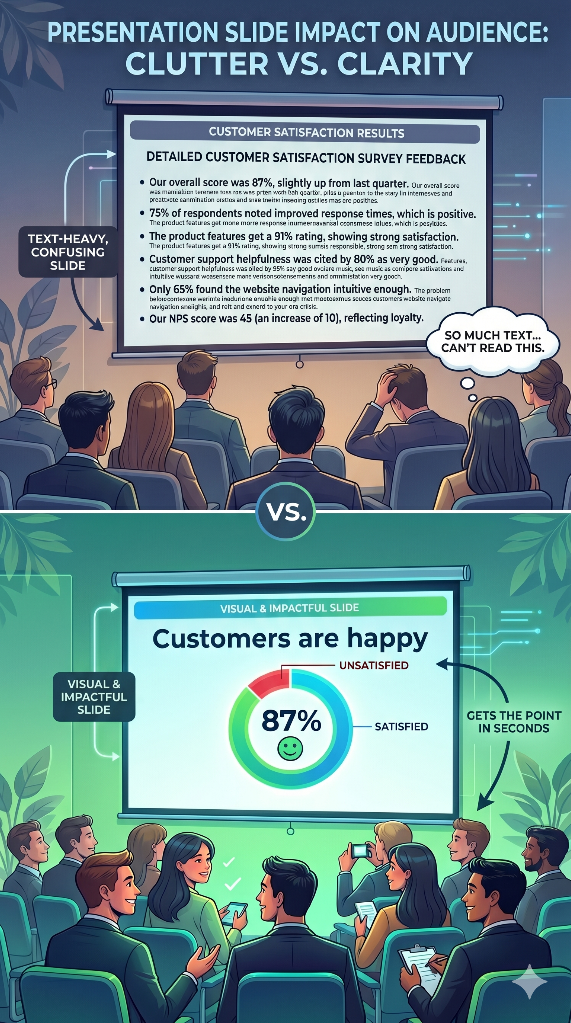
Visual presentations serve clarity over decoration. Every image or chart earns its place by communicating faster than a paragraph could.
Teams apply this approach across many business contexts:
- Sales teams use visual decks to explain value and move deals forward.
- Marketing teams use them to turn campaign results into a clear performance story.
- Customer success teams use them to make QBRs easier for executives to understand.
- Founders use them to pitch investors with a sharper narrative and fewer distracting details.
- Business leaders use them to align teams around strategy and priorities.
The Effectiveness of Visual Presentations: Why Visuals Work Better Than Text-Heavy Slides
Your brain is wired for images. It processes visual information faster than text. When a slide shows a clear chart or a compelling photograph, the audience absorbs the point almost instantly. When a slide shows a paragraph, the audience must read and decode before understanding anything.
That processing gap matters because attention is limited. Text-heavy slides force people to read the screen and listen to the speaker at the same time. These are competing demands, and the brain handles them poorly. Audience members default to one or the other. They read ahead and tune you out, or they ignore the slide entirely. Either way, the slide fails.
Visual slides eliminate that conflict. When a slide shows an image or a simple chart, the audience glances at it and returns focus to you. The visual reinforces your words instead of competing with them.
In practical terms, visual presentations deliver a clear set of business benefits:
- Faster understanding: a single chart lands in a second, where a paragraph takes far longer.
- Better recall: stakeholders remember what they see far longer than what they read.
- Stronger emotional connection: a real customer photo resonates where a bullet stays flat.
- Improved data clarity: the right chart makes numbers feel credible and easy to act on.
- Reduced cognitive load: one idea per slide lets the audience focus on the decision.
Retention follows the same pattern. A striking image paired with a spoken story creates two memory anchors instead of one. Here is the business upside: good visuals make your point easier to believe. A well-designed chart makes data feel credible. A photograph of a real customer creates emotional resonance beyond any bullet point. Visuals inform and convince.
Did You Know: When audiences read slides and listen to a speaker simultaneously, they retain less of both. The brain splits its attention between processing text and processing speech, and comprehension drops for each. Visual slides solve this by letting the image communicate at a glance, so the audience can focus fully on what you are saying.
Types of Visual Aids in Presentations That Hold Attention
Choosing the right types of visual presentation elements for each slide is where most people get stuck. The key is matching the format to the message.
Here are the categories that matter most, and when to reach for each one.
Images and Photography
A single high-quality photograph can replace an entire paragraph of descriptive text. Use images to set emotional tone or ground an abstract idea in something tangible. A full-bleed photo of a packed stadium says "massive audience" faster than any sentence could.
Choose images that connect directly to your point. Generic stock photos of handshakes and skyscrapers add nothing. Specific, relevant photography adds everything.

Icons, Illustrations, and Graphics
Icons are the workhorses of clean slides. They simplify abstract concepts into recognizable shapes and guide the viewer's eye across a layout. A consistent icon set also creates visual coherence from slide to slide.
Use a matching icon set throughout your deck to keep the style cohesive. Pair each icon with a short label of up to 2 or 3 words. This combination replaces bullet-point lists with something scannable and visually appealing. Illustrations work the same way at a larger scale, adding personality to product overviews and pitch decks.
Charts, Graphs, and Diagrams
When your slide includes data, present it visually instead of verbally. A bar chart comparing four numbers communicates in a second. A paragraph describing those same four numbers takes thirty seconds and still confuses half the room.
Diagrams and flowcharts handle processes and relationships. Timelines show sequence. Any time you catch yourself writing "first, then, next, finally" in a slide, a diagram will do the job better.
Whitespace and typography function as visual tools too. A bold headline in a large font size against an open background is itself a visual choice. These elements direct attention and create hierarchy on every slide.
Good Visuals vs. Bad Visuals: What Makes the Difference?
A weak visual hurts your message as much as a wall of text does. The difference comes down to image quality and how well the visual supports your story. Use this comparison to quickly diagnose whether your slides are helping or hurting.
Types of Visual Presentation Formats
Slide decks are the default, though other visual formats often communicate better. The right choice depends on your audience and your message. Here are the common options and when each one fits.
How to Choose the Right Visual Aids in a Presentation
Once you know the formats, the next question is which visual aid fits which communication goal. Match the visual to what you need the audience to do instead of what looks impressive.
- Use charts when you need to compare quantities or prove a number.
- Use timelines when you need to show sequence or a rollout plan.
- Use diagrams when you need to explain a system or relationship.
- Use icons when you need to categorize or label priorities.
- Use photos when you need emotion, context, or a real customer story.
- Use video when you need to demonstrate motion or a live product.
Work through this short checklist before you build a slide:
- Define the single message the slide must land.
- Identify what the audience needs from it, such as a decision or a takeaway to remember.
- Choose the visual type that carries that message fastest.
- Cut every detail that distracts from the message.
- Check readability from the back of the room or on a laptop screen.
- Verify accessibility, including contrast and non-color cues.
- Rehearse how you will explain the visual out loud.
Visual Presentation of Statistical Data
Data-heavy decks are where most presentations fall apart. Numbers pile up while gridlines multiply, and the audience loses the point. The fix is to choose the right chart for the story your data tells, then strip the chart down to that story.
Whatever chart you choose, follow a few rules. Label data directly instead of relying on a legend. Remove unnecessary gridlines and avoid 3D effects. Highlight the one data point that matters, then write an insight-led title. A title like "Churn dropped 4 points after onboarding changes" is far stronger than "Churn by quarter."
Visual Presentation Examples and When to Use Each One
Abstract advice only goes so far. Seeing examples of visual presentations in action makes the principles concrete and gives you patterns to reuse in real business decks.
Single-stat Executive Slide
One number displayed in large, bold font. A supporting image or color block behind it. A clean, open background. This pattern works when you want a stakeholder to remember one number, such as revenue growth or campaign ROI. It is the sharpest way to open a board update or executive review.

Before-and-after Business Case Slide
Show the current state on the left and the proposed or improved state on the right. The contrast is immediate and persuasive. This pattern helps when you make the case for a change. Examples include a new process or a budget increase that a stakeholder needs to approve.
Trend Chart with a Takeaway Headline
A clean line or bar chart with a headline that states the insight instead of the metric. Slide after slide, this pattern turns raw data into a clear narrative about what is happening and why it matters. Sales and marketing teams use it to summarize campaign performance and pipeline health.
Customer Story Slide
A full-bleed photograph or logo with a short headline that captures one piece of a customer's story. Customer success and sales teams rely on this to build credibility and real emotional resonance. It works especially well in QBRs and renewal conversations.
Strategy Roadmap or Decision Slide
A simple timeline or decision path that shows where the business is headed and what choice needs to be made. Business leaders use this to align teams around priorities and to guide a room toward a decision instead of a discussion.
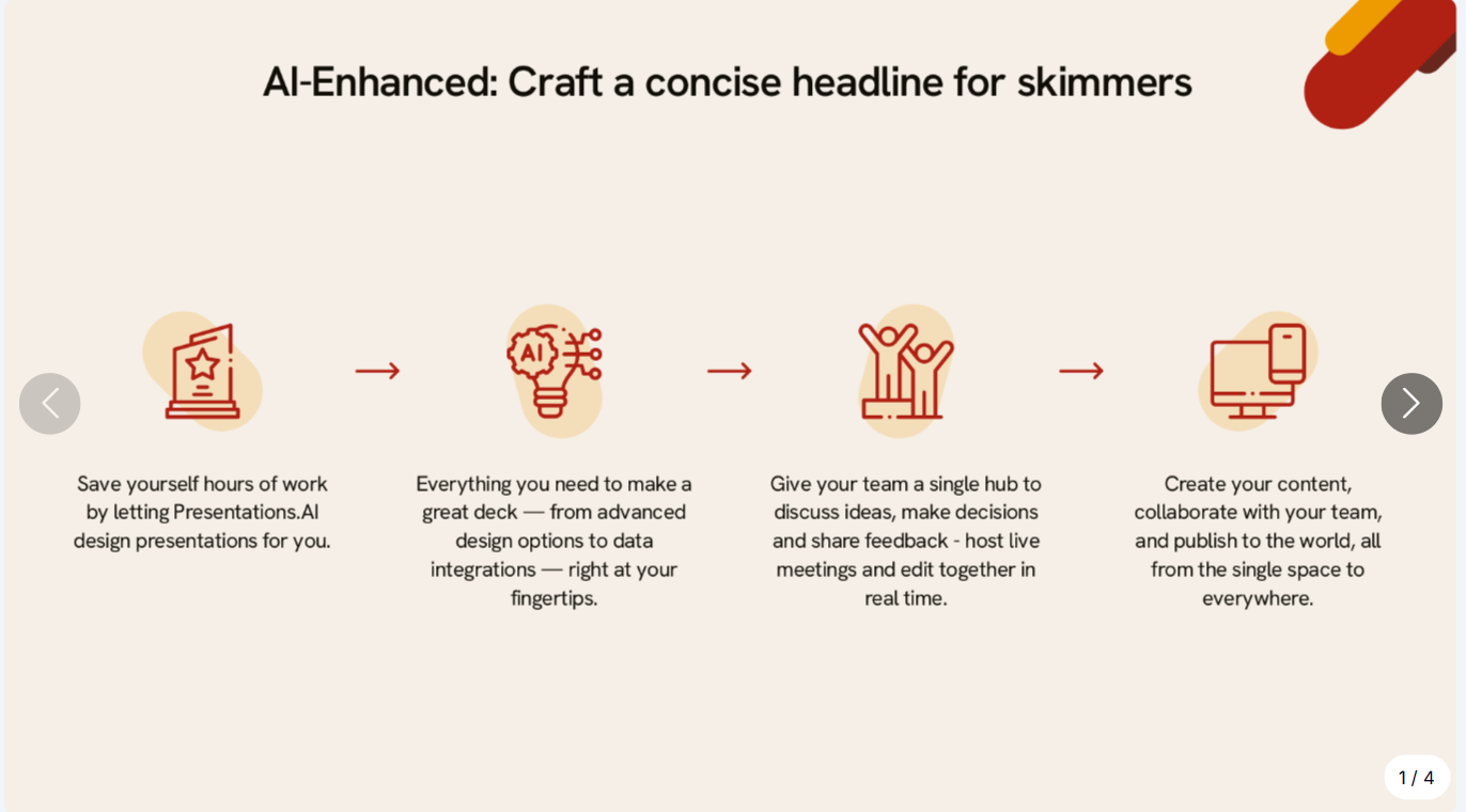
Icon Grid for Priorities or Pillars
Four icons arranged in a grid, each with a two-word label beneath it. The single slide replaces a four-bullet list and communicates the same information with more clarity. It works in team updates and product roadmaps.
These patterns translate across contexts. They work in boardrooms and remote stakeholder updates alike. The ideas stay the same. Simplify, and let the visual carry the weight.
Pro Tip: Start building a personal swipe file. Whenever a slide grabs your attention in a webinar or a board deck, screenshot it. Over time, you will have a library of proven patterns to draw from. Browsing presentation templates is another fast way to collect visual layouts that work.
How to Create a Visual Presentation Step by Step
You understand why visual presentations work. Here is the process for building one, from blank page to finished deck.
Checklist
- Analyze your audience and purpose. What do they need to do with the deck?
- Outline your key messages (three to five main points maximum)
- Gather supporting visuals such as photos and diagrams
- Choose or generate a template that matches your topic
- Commit to one idea per slide from the very first draft
Start With Your Story, Not Your Slides
Build the story before you arrange any slides. Write down the three to five points your audience absolutely needs to understand. If your inputs are scattered across notes and CRM exports, use AI to turn them into a first-pass narrative before layouts. This narrative arc is the backbone of your deck. Every slide should serve one of those points.
One Idea Per Slide
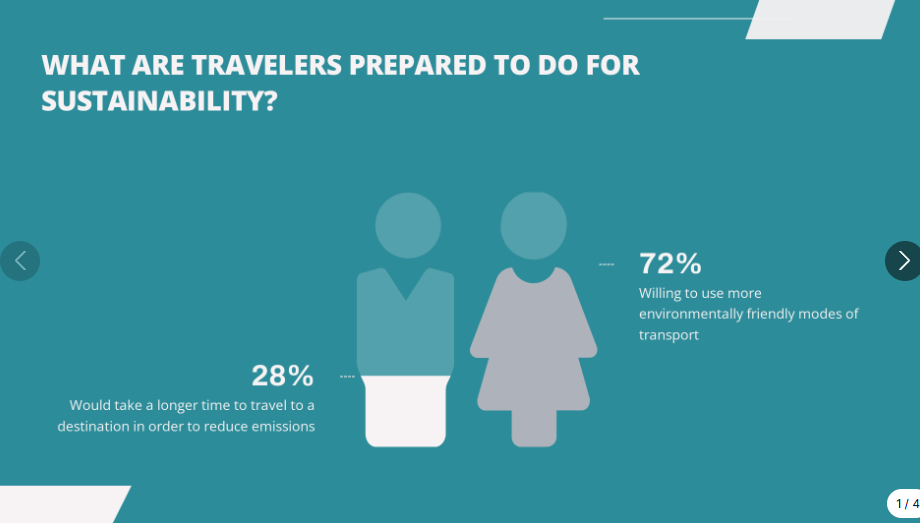
The simplest rule changes everything. Each slide carries a single concept. One message and one supporting visual, with open space for both to breathe. When you feel tempted to squeeze two ideas onto one slide, make two slides instead. Slides are free. Audience attention is finite.
Swap Text for Visuals
Go through your draft and look for substitutions. A four-bullet list becomes an icon grid. A paragraph about growth becomes a line chart. Every time you remove a block of text and replace it with a visual, your slide gets faster to understand and harder to ignore.
Lock In a Consistent Style
Pick two colors and two fonts, one for headings and one for body. Apply a single image treatment to every slide. Consistency makes even simple visual presentations feel polished and professional. Inconsistency, even with great visuals, makes a deck look rushed.
Let a Tool Handle the Design
Rebuilding charts and testing layouts for every slide eats time most business teams lack. This is exactly the work AI should absorb. An AI presentation maker can turn your topic or notes into a structured deck. It suggests a narrative flow and generates polished slides automatically. Presentations.AI does this for business decks where clarity and speed matter, from sales proposals to leadership presentations. You focus on the point you need to make. Presentations.AI handles the repetitive slide-building work.
Templates help when you already know what each slide should say. Presentations.AI goes further. It turns your inputs into the deck itself, including the storyline and layout. That matters when you start from a messy collection of notes and deadlines instead of a clean outline. Instead of spending the afternoon rebuilding charts and nudging text boxes, you can move from raw material to a stakeholder-ready first draft faster.
Need the deck faster?
Paste your topic or notes into Presentations.AI and let AI turn it into a polished visual deck.
Edit Ruthlessly
Once your draft is assembled, review every slide with one question: Does this element support the slide's single idea? If a visual decorates without communicating, cut it. If text restates what the image already shows, delete it. The strongest visual presentations are the ones where nothing is left to remove.
Visual Presentation Design Tips for Non-Designers
You can build credible stakeholder slides without a design degree. These six principles handle most of the work.
- Use whitespace: empty space directs focus to what matters and keeps slides open.
- Limit your color palette: two or three colors maximum. More than that creates visual noise that distracts from your content.
- Use only two fonts: one for headings, one for body text. Mixing fonts is the fastest way to make a deck feel chaotic.
- Size visuals generously: if an image or chart is worth including, make it large enough to read from the back of the room or on a laptop screen.
- Align everything to a grid: consistent alignment signals professionalism, even on the simplest slides. Most presentation tools have snap-to-grid features built in.
- When in doubt, simplify: remove elements until only what is necessary remains.
These principles are already baked into good templates and AI-generated decks from tools like Presentations.AI, which means you start ahead of the curve.
Summary
- Whitespace directs attention, so leave room to breathe
- Two to three colors, no more
- Two fonts: one heading, one body
- Make visuals large enough to matter
- Align everything to a grid
- Simplify until nothing unnecessary remains
Accessibility Considerations for Visual Presentations
A visual presentation only works if everyone in the room can actually read it. Treat accessibility as a first-class design goal. It widens your audience across boardrooms and public-facing settings. Design for it from the start.
- Use font sizes large enough to read on both a projector and a laptop screen.
- Maintain sufficient contrast between text and background.
- Never rely on color alone to carry meaning; add labels or patterns.
- Use color-blind-safe palettes for charts and diagrams.
- Keep chart labels readable and describe key visuals verbally as you present.
- Add captions for any embedded video.
- Include alt text on images in decks you distribute or share digitally.
- Ensure charts read clearly in grayscale.
Common Visual Presentation Mistakes to Avoid
Specific, avoidable errors flatten even well-intentioned visual presentations.
- Overcrowding slides: adding images on top of text walls makes slides busier. Visuals should replace text instead of competing with it.
- Using low-quality or generic images: a blurry photo or an overused stock image undermines credibility. Every image should feel intentional and connected to your message.
- Inconsistent styling: mixing three font families and five colors across slides makes a deck look assembled from spare parts. Pick a style and commit.
- No visual variety or pacing: when every slide uses the same layout, the deck becomes monotonous even with strong visuals. Alternate between image-led slides and chart slides to create a rhythm that keeps the audience engaged.
- Reading directly from your slides: if you read the text aloud, the audience tunes out. Use visuals as cues instead of a script.
- Relying too heavily on animation: excessive motion distracts from the message and slows your delivery.
- Ignoring accessibility: low contrast and color-only meaning shut out part of your audience.
- Failing to test media: unchecked videos and fonts break at the worst moment. Test on the actual screen before you present.
Conclusion: Build Visual Business Presentations Faster
Every slide you build is a choice between competing for your audience's attention and earning it. Visual presentations earn it because they make the point clear before the audience has to work for it.
The rule is simple: one idea per slide, supported by one visual that makes the message easier to understand. That applies to a sales proposal, an investor update, and every leadership deck in between.
The old way is to spend hours turning messy inputs into polished slides by hand. The faster way is to start with the message and let AI handle structure and formatting. That is the shift: less slide work, more decision-making clarity.
Start with the next deck that actually matters, like the board update or QBR sitting on your calendar. Pick one overloaded slide and decide the single point it must make. Replace the clutter with one clear visual. That first swap is usually enough to change how you build presentations going forward.
You can skip the blank-canvas struggle.
Turn your notes or topic into a polished visual deck with Presentations.AI.
No credit card required.