TL;DR
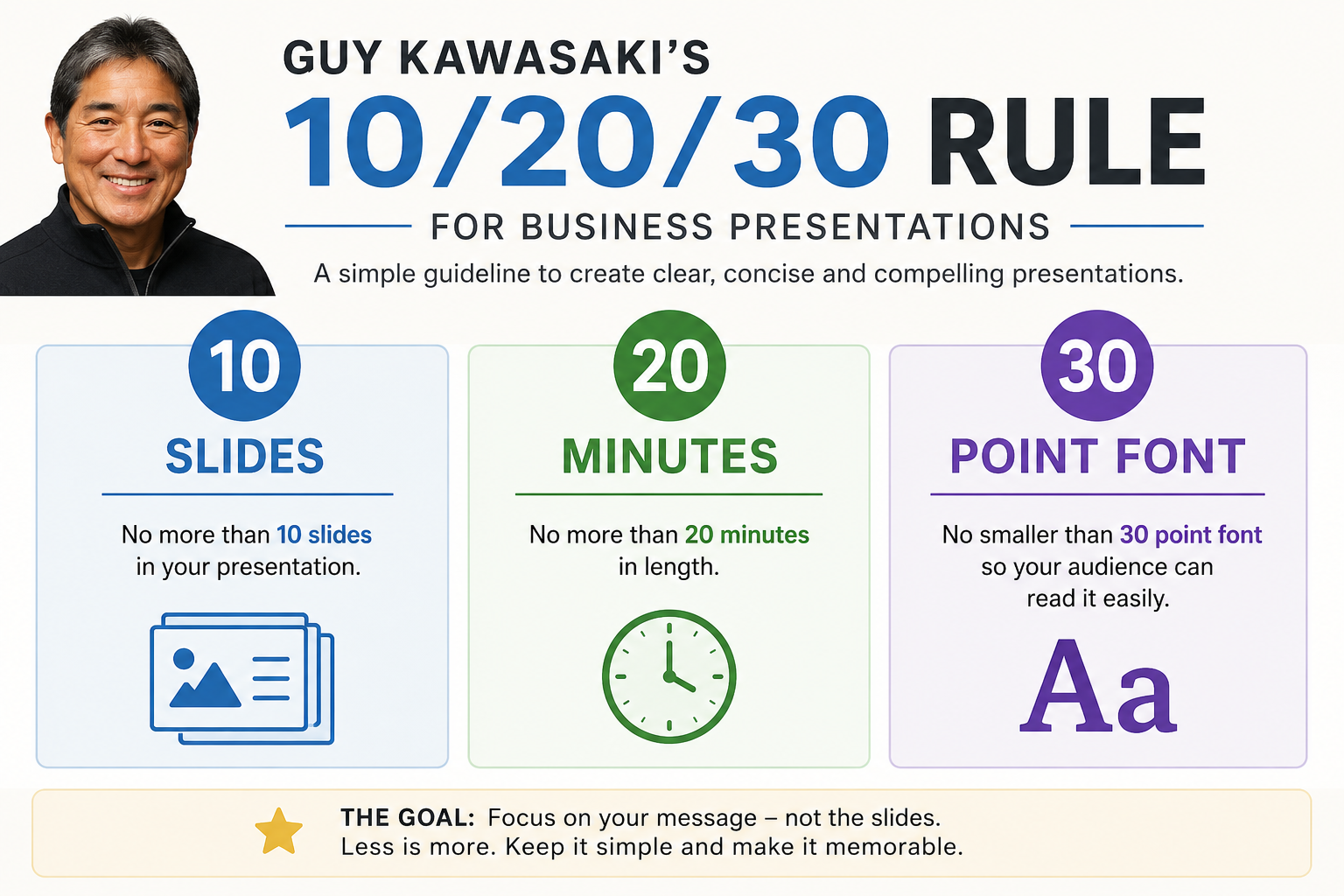
- Guy Kawasaki's 10/20/30 rule caps a presentation at 10 slides and 20 minutes. It also sets a 30-point minimum font to force clarity and protect attention.
- Ten slides forces you to cut every element that fails to earn its place, because each extra slide dilutes the ideas that matter.
- The 20-minute cap is strategic. Attention drops sharply after 15 minutes, and remote audiences leave entirely when you run long.
- A 30-point font physically prevents text overload. When your content overflows, you have too much on the slide.
- Breaking the rule works when you can explain the reason for that audience, such as training or data-heavy reviews.
- AI tools like Presentations.AI help you stay inside the rule by turning messy inputs into focused, readable drafts.
The 10/20/30 Rule, and Why It Still Earns Its Keep
You have an hour on the calendar and a messy doc full of notes. Five stakeholders expect a clean story. The deck keeps growing every time someone adds "just one more slide." That is where the 10/20/30 rule earns its keep.
Guy Kawasaki created it for investor pitches. The reason it still works in 2026 reaches beyond fundraising. It forces business teams to cut the filler and respect the room's attention. Teams also decide what belongs on screen before they drag boxes around in a slide editor.
Slides pile up and text shrinks. Talks run long. This post breaks down each part of the 10/20/30 rule. It shows why the rule holds up in 2026 and how to build a deck that sticks to it. Staying inside it becomes easier when you start lean, which is where an AI presentation maker helps. A blank slide drains productivity. Teams building high-stakes decks every week lose time there. They format and resize slides. They rebuild charts and try to make scattered content look intentional.
What Is the 10/20/30 Rule for Presentations?
The 10/20/30 rule is a presentation framework from Guy Kawasaki, a longtime entrepreneur and venture capitalist in Silicon Valley. He published it in direct response to the bloated pitch decks he saw daily. It comes down to three hard constraints.
The 10/20/30 rule means a presentation should use 10 slides at most and run 20 minutes at most. Every font stays at 30 points or larger. It helps presenters stay concise and respect audience attention. It also keeps slides free of overload.
10 Slides: Focus on the Essential Ideas
Ten slides forces you to distill your message to its essential parts. For a startup pitch, Kawasaki originally mapped those ten slides to: problem, solution, business model, underlying magic, marketing and sales, competition, team, projections, status and timeline, and summary/call to action. The principle applies just as well to sales decks and quarterly reviews. Project proposals benefit too. If you want to see how a focused pitch deck is structured, this guide to pitch deck structure walks through each slide in detail.
Why ten specifically? Kawasaki's observation was simple. A normal human struggles to process more than ten concepts in one sitting. Every slide beyond ten dilutes the ones that matter.
Here is the truth. Most decks run long for one reason: someone skipped the hard editing decisions early. The topic itself stays simple enough.
20 Minutes: Leave Time for Questions and Discussion
The rule caps your presentation at twenty minutes, even when your meeting slot runs sixty. The remaining forty minutes cover questions and discussion. Expect five minutes lost to IT setup and "can everyone see my screen?"
Twenty minutes matches how attention works. Research on cognitive load shows that focus drops sharply after the 15-minute mark. A short talk reflects strategy and discipline.
30-Point Font: Make Every Slide Readable
The 30-point font is the piece most people push back on. Thirty points feels enormous when you are used to cramming paragraphs onto slides. That is the point.
A 30-point minimum does two things at once. First, it makes your slides readable from the back of a conference room. It stays legible on a laptop in a Zoom call and on a phone when someone opens your shared link later. Second, it limits how much text fits on a slide. You then talk about your content instead of reading it. Your slides become prompts for your narrative and support the story.
Kawasaki put it bluntly. If you need smaller text, you know your material too little. Harsh, and accurate.
Why the 10-20-30 Rule Works for Presentations
Any one of these three rules helps on its own. The real power comes from the combination. Ten slides keeps you focused. Twenty minutes keeps your audience engaged. A thirty-point font keeps you honest about what belongs on screen. These constraints interlock. Break one, and the other two start to fall apart.
The 10/20/30 rule builds a presentation where every slide earns its place. Every minute respects your audience, and every word on screen stays big enough to read. That bar sits higher than most decks clear, which explains why the framework has lasted nearly two decades.
Benefits of the 10-20-30 Rule for Presentations
The value of the rule shows up in outcomes over aesthetics. Here is what you get when you stick to it:
- Clearer messaging: Ten slides force you to lead with the point instead of burying it in context.
- Better audience engagement: A twenty-minute cap keeps people leaning in instead of checking out.
- Stronger time discipline: You protect the meeting slot and leave room for the conversation that moves decisions.
- Improved readability: A 30-point floor makes every slide legible in the room and on a laptop. It stays readable on a phone later.
- Easier decision-making: A tight deck makes the ask obvious, so the room can act instead of untangling detail.
- More productive Q&A: Detail lives in the discussion and the appendix, away from the slide, so questions get real answers.
How To Check If Your Deck Actually Follows 10/20/30
Before you present, run the deck through this quick check:
- One idea per slide: If a slide needs three explanations, split it or cut it.
- Decision-first structure: Every slide should move the audience closer to a decision instead of adding context.
- No text walls: If the slide works only when people read every sentence, it fails its job.
- Appendix for detail: Keep backup data available, and leave it out of the main story.
- Time the talk track: If the core story runs past 20 minutes, the issue is usually structure over speed.
Examples of 10-20-30 Rule Presentations
The rule makes more sense when you see what it forces people to leave out.
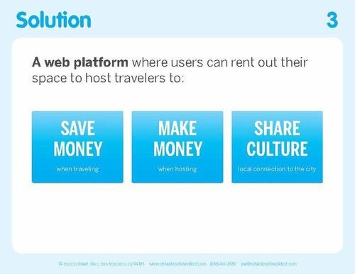
Airbnb (2009 seed round, $600K raised): Exactly ten slides. Each slide carried one idea and nothing more. The business model was a single line: "We take a 10% commission on each transaction." The lesson is that a single, clear idea per slide is easier to fund than a slide crowded with caveats.
YouTube (2005 Series A, $3.5M raised): Ten slides at a time when the platform had fewer than 10,000 users. The deck told a complete story on its own. Sequoia invested, and Google acquired YouTube sixteen months later. The lesson goes beyond ten slides guaranteeing funding. A tight deck makes the decision easier for the room.
Dropbox (2007, $1.2M from Sequoia): Slightly over ten slides, and one of the leanest decks of its era. The problem was framed so anyone could feel it immediately. The solution looked obvious, and the narrative stayed simple. The point is that clarity makes a deck land, more than slide count alone.
Guy Kawasaki's own template: He wrote the rule and built a ten-slide deck to demonstrate it. Worth a look, because it makes the constraint tangible.

Uber (2008 seed round), the counter-example: Twenty-five slides. It still raised $200K on the strength of the narrative and timing thesis, well beyond the deck length. Analysts who break it down today point to the bloat as a weakness. A great idea can survive a bloated deck, though the bloat only adds drag.
Does the 10/20/30 Rule Still Work in 2026?
Kawasaki published this rule in 2005, when presentations happened in conference rooms and projectors took three minutes to warm up. Work has changed a lot since then. It is worth asking whether a framework built for in-person VC pitches still fits how meetings run today.
The real challenge in 2026 is the hybrid meeting. Part of your audience sits in the conference room. Another part joins on a laptop from a different floor or city. That creates two viewing conditions at once, and you design for both.
That is where ten slides matters more than ever. The person in the room and the person on the call fight the same attention battle. Both lose patience with a 40-slide deck, and the remote viewer battles every other app on the computer.
Twenty minutes matters because hybrid meetings run hard to manage on time. When people across locations coordinate around a shared calendar slot, running long moves past impolite. It breaks everyone's day.
Thirty-point font matters because your slides now serve two screens. They must stay legible on a 27-inch monitor in the room and a 13-inch laptop at a desk. Text that reads fine on a projector turns hard to parse on a smaller screen.
There is also the asynchronous layer. Decks get shared after meetings through Slack and email.
Someone who missed the room scrolls through your slides on a phone or tablet later. A deck designed for a 30-point minimum survives that trip. A deck built on 11-point text walls falls apart.
One thing holds steady and will stay that way: attention spans. Your audience's habits come from formats that demand instant clarity. A deck that takes three slides to reach the point loses people who expect the main idea in the first thirty seconds.
The 10/20/30 rule was ahead of its time in treating brevity as a design principle. That has become more true as the pace of everything else has picked up.
The 10/20/30 rule remains the best default in 2026. It fits pitches and sales decks. It fits board updates and project proposals too. The real challenge lies beyond knowing the rule. It lies in building a deck that follows it.
That is where AI changes the workflow. Instead of opening a blank deck and adding slides until the story feels complete, you can start with a focused structure and edit from there.
How to Use the 10-20-30 Rule for Different Presentation Types
Kawasaki built this for VC pitches, but the framework adapts to nearly any business presentation. Here's what ten focused slides look like in five common scenarios:
Sales deck: Customer problem, cost of inaction, your solution, how it works, differentiation, social proof or case study, pricing overview, implementation, ROI, next steps. Ten slides keeps you from turning a sales conversation into a product demo. Your prospect should be talking by slide six.
Quarterly business review: Key metrics, what worked, what missed, root causes, customer feedback, competitor map, strategic priorities, resource needs, timeline, decision points. This one stays the hardest to keep at ten slides because stakeholders want detail. Resist. Put supporting data in an appendix or a linked doc. Your slides should drive the discussion and support it.
Investor or fundraising pitch: Problem, solution, market size, business model, traction, go-to-market, competition, team, financials, the ask. This flow stays closest to Kawasaki's original template, and it still works because investors see hundreds of decks and reward clarity.
Marketing performance review: Goal, campaign context, top-line results, channel performance, audience insight, what worked, what missed, budget implications, next experiment, decision needed. The rule keeps the deck from becoming a data dump. Your job skips showing every chart. Your job makes the next move obvious.
Customer success renewal deck: Customer goals, adoption summary, usage trends, value delivered, risks, success stories, expansion opportunities, roadmap alignment, recommendation, next steps. Ten slides keeps the conversation focused on outcomes instead of overwhelming the customer with product metrics.

Presentations.AI gives you more than a template. It builds a structured first draft for the deck you need, from sales and fundraising to QBRs and customer reviews. You start with the story arc instead of assembling slides one by one. Starting from a focused draft beats cutting down a bloated one. Staying within ten slides comes easier when you start with ten instead of forty.
How to Apply the 10-20-30 Rule to Your Next Presentation
Knowing the rule is easy. Building a deck that follows it takes a repeatable workflow. Run through these steps:
- Define the decision or outcome. Write one sentence describing what you want the room to decide or do. Every slide has to serve that sentence.
- Outline the ten core ideas. List the ten points that get you to that decision. If you have more than ten, prioritize ruthlessly.
- Assign one idea per slide. Map each idea to a single slide. If a slide needs two explanations, it is two slides or one cut.
- Move the detail to an appendix. Push supporting data and deep charts into an appendix or a linked doc. Keep backup answers there too.
- Rehearse to twenty minutes. Time your talk track. If you run over, the problem is usually structure over speed.
- Raise your text to a 30-point minimum. If the content stops fitting, that signals too much on the slide.
- Test readability on laptop and mobile. Open the deck on a 13-inch screen and a phone to confirm it survives hybrid and async sharing.
10-Slide Presentation Template
Use this universal ten-slide structure as a starting point for any business deck. Adapt it to a sales deck or an internal update next.
Need a tighter deck now? Turn your prompt, notes, doc, or URL into a focused first draft with Presentations.AI.
How Presentations.AI Helps You Start With a Tighter Deck
Most presentation tools stay neutral about discipline. Presentations.AI takes a side. Traditional slide tools hand you a blank screen and make every choice your problem. You own the structure and layout. You handle formatting and branding. You clean up charts and manage export. That is exactly how a ten-slide idea turns into a forty-slide deck.
Presentations.AI works more like an AI presentation assistant. It turns a prompt or a set of messy notes into a focused first draft. You start with a clearer structure instead of building from scratch. That matters because most bloated presentations begin small. They start as scattered inputs, and people lack time to shape them into a clean narrative.
Traditional tools reward adding slides and resist sharpening the deck. That default hurts business teams. Presentations.AI starts from the opposite assumption. The first draft already carries a point and a structure. It arrives with a clean visual system. Your job refines the message instead of rebuilding the deck.
Here is where that changes the day-to-day workflow:
- The AI keeps slides content-focused by default. You skip the wall of placeholder text that tempts you to keep filling. Each slide centers on a single idea, exactly what the rule asks for.
- Brand Sync applies your colors and fonts automatically, and it places your logo for you. That removes the urge to spend editing time on aesthetics instead of tightening your message.
- The template library is organized around real use cases like pitch decks and business reviews. Browse it and you find structures that map closely to the ten-slide frameworks above.
- Flexible templates keep your layouts clean however you edit. Even while you iterate, the design holds together into something worth sharing.
- When decks change, AI-assisted updates cut the manual cleanup. That helps recurring business reviews and stakeholder updates, where the structure holds steady while the numbers and story keep moving.
- The .pptx export keeps the deck usable for collaborators and clients who still work in PowerPoint.
- The 10/20/30 rule asks you to edit better. Presentations.AI makes that easier with a lean starting point instead of a blank screen that rewards addition.
Final Takeaway: Use Constraints to Build Better Presentations
The 10/20/30 rule has lasted nearly twenty years because it gets one thing right: the constraint is the point. Ten slides, twenty minutes, and thirty-point font carry real reasons. They come from someone who sat through thousands of bad presentations. He worked backward to find what separates the decks that land from the ones that lose a room.
You can skip following the rule mechanically in every situation. Use it as your default, and break it only when you have a real reason. You will build better presentations than you would with no constraints at all. Fewer slides means more clarity. Shorter delivery means more respect for your audience. Bigger text means more honest choices about what belongs on screen.
If you want a focused deck without starting from a blank slide, try Presentations.AI for free. Give it your notes or a URL, and start from a tighter first draft instead of cutting down a bloated one later. The structure is already there. You bring the story and sharpen the point. Then you use the deck to earn the next decision.