TL;DR
- Interactive presentations use polls and live Q&A to turn passive stakeholders into active participants. These participants stay with the decision you need.
- Embedded video and animation add proof and depth. Overusing them creates distraction instead of the alignment a business deck needs.
- Match each interactive element to a specific goal, such as reinforcing a point or surfacing objections before you ask the room to decide.
- Space interactive moments every three to five slides to keep energy high while protecting your narrative flow.
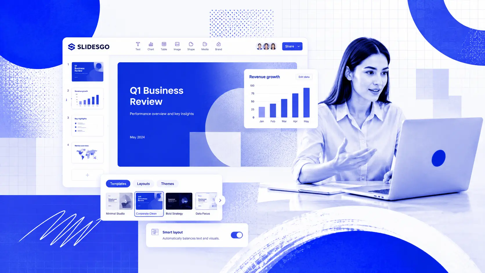
- Presentations.AI helps you turn notes, docs, or existing content into polished interactive decks faster. You spend less time formatting slides and more time shaping the decision.
The Format Problem Behind Disengaged Rooms
You pulled together the numbers and shaped the story. The result looks like a solid deck. Then halfway through the sales pitch or leadership update, attention drops. Cameras go off. Phones come out. The issue is usually the format instead of the content. Static slides ask stakeholders to sit and absorb. Interactive presentations give them a reason to participate and stay with the decision you are trying to drive.
Interactive features such as polls and live Q&A turn a one-way broadcast into a two-way conversation. They give the room a reason to stay present. Knowing which elements to use and where to place them takes intention.
The hard part goes beyond knowing that interaction helps. The real challenge is building it fast. You want to skip another night of formatting buttons and rebuilding slides. That is where AI changes the workflow. It helps turn your raw notes or existing content into a structured deck with the right interactive moments already mapped in.
This guide walks you through making an interactive presentation step by step. You will learn what each element does best and when to deploy it. You will also learn how to avoid the common trap of overdoing it. For a broader foundation, presentation skills cover the core habits that make any format work better.
What Is an Interactive Presentation?
The word interactive gets tossed around loosely. A single transition effect falls short of true interactivity. Adding a flashy GIF on slide four falls short as well. True interactivity means the audience does something, such as clicking or voting, and the presentation responds.
Passive vs. Interactive: The Core Difference
A passive presentation flows in one direction. The speaker talks. The audience watches. An interactive presentation creates feedback loops. The audience provides input, and the content adapts or acknowledges that input in real time.
Think of it this way: a passive deck is a lecture. An interactive deck is a conversation. A static product overview becomes a clickable product demo. A one-way webinar becomes a poll-driven working session. A lecture-style training becomes a quiz-based one where retention is checked in the room.
Operator rule: If your audience can leave the room and the presentation runs the same, you built a slideshow. Interactivity requires their input.
Why Interactivity Matters More Now
Business audiences are harder to hold because every meeting competes with Slack and the next decision on their calendar. In a boardroom or virtual QBR, interactivity gives people a reason to stop watching passively. They start engaging with the point you need them to understand.
The goal reaches beyond participation for its own sake. The goal is to keep the room involved long enough to discuss the tradeoff and make the decision.
Quick check: Find two or three moments where attention drops, such as after dense data or before the ask. Those are your best places to add interaction.
How to Make an Interactive Presentation Step by Step
Building an interactive deck requires deliberate choices at each stage of your workflow. Cramming every feature into every slide undermines that goal. Follow these steps to create a presentation that earns and holds attention from the first slide to the last.
Step 1: Define Your Goal and Audience
Before you touch a single slide, clarify two things. What decision do you want the room to make after this presentation? And who exactly is sitting in those seats?
- Sales team: Use clickable navigation so an executive buyer can jump from ROI to customer proof in one click.
- Marketing team: Use a live poll before presenting campaign results to surface which channel the room believes performed best.
- Customer success team: Use embedded product usage clips or interactive account health snapshots during a QBR.
- Founder: Use clickable appendix slides so investors can dig into market size or financial assumptions while your pitch stays on track.
- Leadership team: Use quick sentiment checks during strategy updates to identify alignment gaps before asking for a decision.
Your goal shapes which interactive elements belong in the deck. Your audience shapes how many you can include while keeping their attention.
Manual workflow vs. AI-assisted workflow
Manual presentation building forces you to make every structural and visual decision slide by slide. An AI-assisted workflow starts with your content and helps turn it into a clear, designed, stakeholder-ready deck faster.
Step 2: Outline Your Content Before Adding Interactivity
Write your narrative arc first. Before adding any interactive layer, it helps to sketch out a presentation outline that maps your key messages and transitions. Treat interactivity as a layer you add on top of a strong foundation. A weak story stays weak even with polls attached.
A common mistake is designing around the interactive feature instead of the message. Polls earn their place, and quizzes serve a purpose. Every interactive moment should serve a purpose you can name in one sentence.
You might start from messy inputs like meeting notes or CRM exports. Turn those inputs into a clear narrative before adding interaction. Interactivity leaves a scattered story just as scattered.
Before you build: Draft your outline on paper or in a simple document first. Mark the specific slides where audience energy might dip. Those are your interactive insertion points.
Step 3: Choose the Right Element for Each Moment
Match each interactive feature to the job it needs to do at that point in the deck.
- Opening slides: Use a poll or a quick sentiment check to warm up the room and signal that participation is expected.
- After a complex section, insert a quick knowledge-check quiz to confirm the room absorbed what you just covered.
- During a case study or demo: Embed a short video so stakeholders see the concept in action while staying inside the deck.
- Mid-presentation energy dip: Add a clickable slide that lets the room choose which topic to explore next.
- Closing section: Open a live Q&A to surface objections that matter most to the people making the decision.
The key principle is one element per moment, one purpose per element. Stacking a poll and an animation on the same slide creates noise instead of clarity.
Step 4: Build Your Slides With Interactive Layers
Now create your slides. Place your core content first, such as headlines and body text. Add supporting visuals next. Then layer in the interactive components where your outline marked them.
For animations, use progressive reveals to walk through complex ideas one point at a time. Keep embedded video clips under 90 seconds so they support your narrative instead of hijacking it. Label clickable navigation buttons clearly so viewers know exactly where each path leads.
Operator rule: Every interactive element should feel like a natural extension of the slide. If it feels bolted on, cut it or move it.
This is also where manual slide tools slow teams down. Every button and navigation path has to be formatted and checked by hand. With an AI-assisted tool like Presentations.AI, you start from the content and let the platform handle the structure and formatting work.
Shortcut: If you already have notes or an existing deck, you can skip building every interaction manually. Presentations.AI can help turn your content into a structured, polished presentation with interactive elements added faster. Try for Free
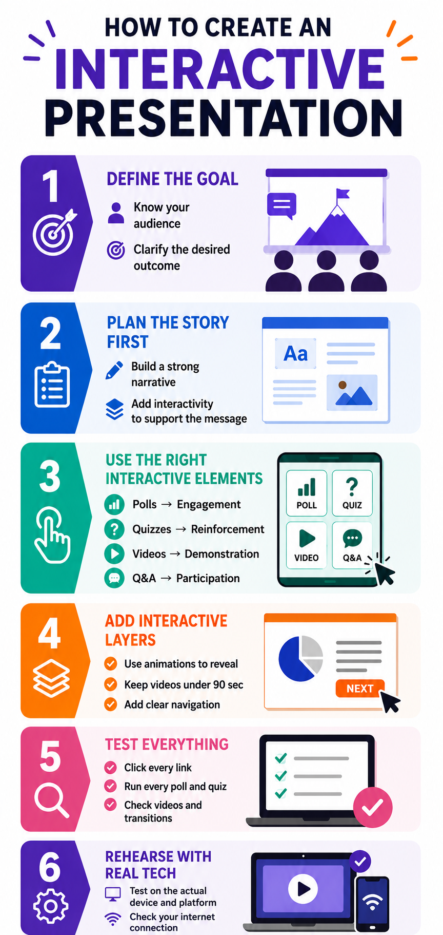
Step 5: Test the Flow From Start to Finish
Run through the entire presentation as if you are an audience member. Click every button. Answer every poll. Watch every embedded video. Check that each interactive moment lands at the right time, and that transitions back to your content feel smooth.
Ask a colleague to experience the deck cold. If they hesitate at any interactive prompt or skip past it, that element needs to be reworked or removed.
Step 6: Rehearse With the Tech
Interactive features depend on technology working as expected. Rehearse with the actual platform and internet connection you will use on presentation day. Test that polls load and videos play without lag.
A frozen poll or a video that fails to buffer kills interactive momentum faster than almost anything else.
Pre-Presentation Testing Checklist
Run this checklist before any high-stakes deck goes live:
- Every clickable link and navigation path opens the correct slide or destination.
- All embedded videos play and stop smoothly.
- Polls and quizzes load and record responses in real time.
- The deck renders correctly on the presentation-day device and screen resolution.
- Internet access is confirmed, with a mobile hotspot as backup.
- Interactive elements are keyboard-accessible and captioned where needed.
- A backup file (PDF or offline export) is ready if the live version fails.
- Total run time, including interactive moments, fits your allotted slot.
Best Interactive Presentation Elements and When to Use Them
Knowing what each tool does is only half the equation. Knowing when to deploy it and when to leave it out separates a thoughtful interactive deck from a cluttered one. These presentation tips cover broader design principles that apply just as much to interactive elements as to static ones.
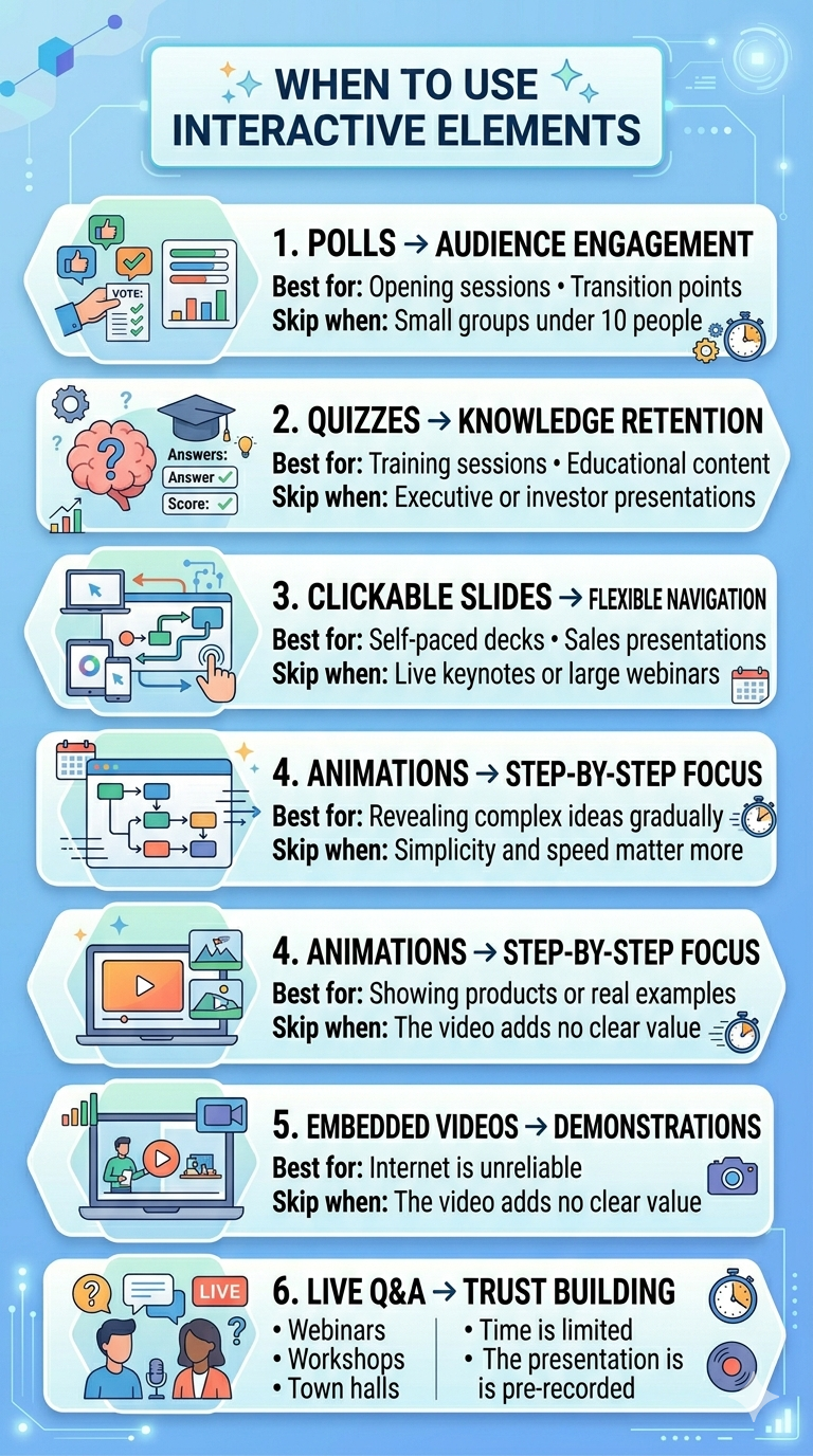
1. Polls: Best for Reading the Room
Polls shine at the start of a presentation or at transition points between major sections. They give the room an immediate, low-effort way to participate. They also give you real-time data about who is present and what they care about.
Skip polls when your audience is smaller than ten people. In a small group, a verbal question creates a more personal connection than a digital poll will.
2. Quizzes: Best for Reinforcing Knowledge
Quizzes work well in onboarding and any session where retention matters. Place them after you deliver a key concept so the room can process and apply what they just learned.
Skip quizzes in executive briefings or investor pitches. Decision-makers want to evaluate your ideas instead of being tested on them.
3. Clickable Slides: Best for Non-Linear Exploration
Clickable navigation turns a rigid slide sequence into a choose-your-own-path experience. This works well for self-paced decks and sales presentations where different stakeholders want different levels of detail.
Skip clickable slides in live keynotes or large webinars where you control the pace. Non-linear navigation in front of a large audience feels disorganized unless you rehearse it thoroughly.
Best-fit use case: Clickable slides help most with asynchronous sales follow-ups and board pre-reads, where each stakeholder may want a different level of detail.
4. Animations: Best for Controlled Reveals
Animations help you pace the delivery of information on a single slide. Bullet points that appear one at a time or diagrams that build piece by piece keep the room focused on one idea at a time.
Skip animations when simplicity matters more than storytelling. In those cases, a clean, static slide communicates faster and with more authority than an animated one.
5. Embedded Videos: Best for Showing, Not Telling
Videos bring demonstrations and real-world context into your deck while keeping viewers inside it. Use them when a visual explanation is stronger than a verbal one.
Skip videos when your internet connection is unreliable or when the clip adds length instead of insight. If you cannot explain what the video accomplishes in one sentence, cut it.
How to Make an Interactive Video Presentation
An interactive video presentation goes beyond hitting play. Add clickable chapters so stakeholders jump to the segment they care about. Insert pause-and-answer prompts to check understanding at key moments. Keep clips short and add captions for accessibility. Prepare a static fallback slide in case connectivity fails. This format is strongest for product demos and customer-proof moments where showing beats telling.
6. Live Q&A: Best for Building Trust
Live Q&A signals transparency. It tells the room you are confident enough to face unscripted questions. Use it at the end of webinars and town halls where stakeholder concerns need direct answers.
Skip live Q&A when time is extremely limited or when the format excludes spontaneous discussion, such as a pre-recorded presentation.
Examples of Interactive Presentations by Use Case
Instructions land faster with examples. Here is how interactive elements map to common business scenarios, along with a simple slide-flow for each.
Sales Demo
Goal: Move an executive buyer from interest to decision. Open with a clickable agenda and embed a short product-in-action clip during the demo. Use clickable appendix slides for ROI and implementation detail. Close with live Q&A to handle objections in the room.
Quarterly Business Review (QBR)
Goal: Prove impact and align on next steps. Open with a quick sentiment poll on account health, then animate the performance data one metric at a time. Embed a usage clip as proof and end with a live discussion on renewal priorities.
Webinar
Goal: Hold a large, remote audience. Start with a poll to make the crowd feel seen. Insert a knowledge-check quiz after your core segment and reserve live Q&A for the final ten minutes.
Investor Update
Goal: Communicate traction while keeping the narrative tight. Keep the main flow tight and linear. Use clickable appendix slides so investors can dig into market size or financials on demand.
Product Walkthrough
Goal: Show the product in action. Combine progressive animations for the workflow with an embedded, chaptered video so viewers control the pace of the demo.
Internal Town Hall
Goal: Build alignment and trust. Use live sentiment polls to gauge the room, then open a live Q&A so leadership can address concerns directly.
How to Structure an Interactive Presentation
Choosing the right elements is only useful if they land in the right place. A reliable structure gives every interactive moment a home in the narrative.
- Opening hook: Frame the decision or problem in one clear line.
- Warm-up interaction: A poll or sentiment check to signal participation is expected.
- Agenda: Set expectations, ideally with clickable navigation for non-linear audiences.
- Core story or problem: Build the argument with animated reveals so complex data lands in sequence.
- Interaction checkpoint: A quiz or embedded video to reinforce the key insight.
- Demo or proof: Show evidence while staying inside the deck.
- Q&A: Surface objections before the ask.
- Recap and call to action: Restate the decision you need and the next step.
For a ten-slide deck, aim for two interactive touchpoints; for a twenty-slide deck, four to six. Place them at the warm-up and before the ask, with one after your densest section.
More Ways to Make a Presentation Interactive
The six core elements cover most needs, but a few additional tactics can sharpen engagement when they fit the moment. Each comes with a when-to-use and when-to-skip note.
Icebreaker Questions
A low-friction opener warms up the room. Keep it relevant to the topic and under two minutes, then use responses to transition into your main message. Skip it when time is tight or the audience is senior and expects you to get to the point.
Storytelling
Build a problem-solution arc and use audience input to personalize it. Place a quiz or poll at turning points so interaction reinforces the narrative instead of interrupting it. Skip elaborate storytelling when the room only needs a fast decision.
Interactive Charts and Graphs
Let stakeholders hover or drill into data during reviews and QBRs. Use it when the data rewards a closer look. Skip it when a single, clean takeaway beats a dataset people must dig through.
Collaborative Whiteboarding
Useful in workshops and strategy sessions where the room co-creates the output. Skip in one-way updates or large audiences where coordination breaks down.
Audience Reactions and Show-of-Hands
Quick reactions or a show of hands gauge sentiment with almost no setup. Use in live and hybrid meetings. Skip when you need recorded, structured data instead of a quick read.
QR Codes and Social Prompts
QR codes give the room instant access to resources or sign-up forms. Use for events and public-facing sessions. Keep them optional and skip when the audience is small enough to share a direct link.
Interactive Presentation Mistakes to Avoid
The biggest risk with interactive presentations is too much engagement demand. When every slide demands something from the audience, participation starts to feel like work. The goal is rhythm over relentless stimulation.
The Spacing Rule: One Interactive Moment Every 3-5 Slides
A practical rhythm is one interactive element every three to five slides. This gives the room time to absorb your content between participation moments. It also keeps each interactive beat feeling fresh instead of repetitive.
A twenty-slide deck supports four to six interactive touchpoints total. That is enough to sustain engagement while keeping your stakeholders fresh.
Quick check: Map your interactive elements on a simple grid alongside your slide numbers. If you see two interactive moments back-to-back, move one or remove it entirely.
Mixing Element Types Keeps Energy Varied
Using the same type of interaction repeatedly dulls its impact. A deck with five polls in a row feels monotonous even though each poll technically invites participation. Alternate between polls and quizzes so the room encounters variety.
Think of interactive elements like seasoning. A pinch of each enhances the dish. Too much of any single one overwhelms the flavor.
Every Element Needs a Clear Job
Before adding any interactive feature, ask one question. What does this accomplish that a static slide misses? If the answer is vague, drop the element.
A poll that gathers genuine stakeholder sentiment earns its place. A poll that exists only because the slide felt empty wastes everyone's time. Be ruthless about cutting interactive features that serve the presenter's anxiety instead of the room's need to decide.
Watch for Technical Overload
More interactive elements mean more moving parts. Each poll or embedded video is a potential point of failure. The more you add, the higher the chance that something breaks during your live presentation.
Keep your interactive layer lean enough that a single technical glitch leaves the rest of the experience intact. Always have a verbal backup plan for every interactive moment in your deck.
Accessibility Mistakes That Exclude Participants
Interactive elements can create barriers when you build them for only part of the room. Use readable contrast and clear button labels. Add captions for video and provide a verbal alternative for every poll. Avoid motion overload. Make QR codes optional and share materials after the session so everyone can follow along.
Operator rule: The most engaging interactive presentations feel effortless to the audience. That effortlessness comes from restraint instead of packing in every available feature.
How Presentation Software and AI Tools Make Interactivity Easier
Building this manually in PowerPoint or Google Slides is where the workflow breaks down. The job goes beyond choosing a poll or adding a button. You format layouts and check spacing. You rebuild navigation and adjust animations while keeping the deck visually consistent. That is exactly the kind of repetitive work AI should remove from the presentation process.
AI-powered presentation tools change the workflow. Instead of starting from a blank slide, you start from your notes or existing content. The tool helps structure the narrative and suggest where interactive elements support the story.
Traditional slide tools give you a blank page and leave the structure and interaction design to you. Generic design tools can make slides look better, but they still require manual cleanup. Presentations.AI is built for the workflow before the slide is polished. It turns rough inputs into a clear narrative and keeps the presentation consistent as the content changes.
What AI Handles for You
Modern AI presentation platforms analyze your content and suggest where interactive elements fit best. Instead of guessing which slide needs a poll or where an animation adds value, the tool recommends placements based on your content structure and audience type.
AI also handles the design side. Polls and clickable buttons format automatically to match your visual theme. You skip the tedious work of aligning shapes and resizing elements across dozens of slides.
Where Presentations.AI Fits In
Presentations.AI works like an AI presentation assistant instead of another blank-slide tool. You can describe your topic or upload existing content. The platform structures the narrative and suggests interactive moments where they make sense.
That matters when you are building a sales pitch or investor update under time pressure. Instead of spending hours formatting buttons and rebuilding sections, you can focus on the decision and the outcome you need from the room. The AI slide creator can then turn that content into slides that stay visually consistent as the message changes.
Quick check: Use AI-generated interactive placements as a starting point, then adjust based on your specific audience and setting. The tool handles the heavy lifting while you keep creative control.
How to Choose Interactive Presentation Software
Before committing to any tool, evaluate it against the capabilities that actually matter for business decks. Use this as a neutral checklist instead of a feature race.
- Ease of use: Can a non-designer build a polished deck on the first try?
- Live polling and quizzes: Native support built directly into the platform.
- Non-linear navigation: Clickable paths for stakeholder-driven exploration.
- Video embedding: Clean playback and chaptering inside the deck.
- Collaboration: Real-time editing and shared team access.
- Analytics: Insight into what viewers engaged with after sharing.
- Export options: Reliable PowerPoint and PDF output when stakeholders need a file.
- Template quality: Business-ready starting points for sales and investor decks.
- AI assistance: Turns raw notes or outlines into a structured, interactive deck.
- Integrations, accessibility, and reliability: Fits your stack and holds up live.
Weigh must-haves against nice-to-haves for your specific format. A live sales pitch has different needs than a self-paced follow-up.
Create an Interactive Presentation Your Audience Will Remember
An interactive presentation is a deliberately designed experience where every poll and clickable element serves a clear purpose. The principles behind it are straightforward. Know your goal, then place the right elements with intention.
Start with your goal and audience. Outline your content before layering in interactivity. Match each element to the specific job it needs to do at that point in your narrative. Space those moments every three to five slides so the rhythm feels natural. Then test everything before you present.
The difference between a forgettable deck and one that holds attention from start to finish is rarely about adding more. Adding the right things in the right places is what drives participation. Each element, from polls to live Q&A, solves a specific engagement problem. The skill is matching each one to the moment where it creates the most value.
Presentations.AI helps you move from raw notes or existing content to a polished interactive deck faster. You spend less time formatting slides and more time shaping the decision you need the room to make.